WE BUILD CURRICULUMS SINCE 1989
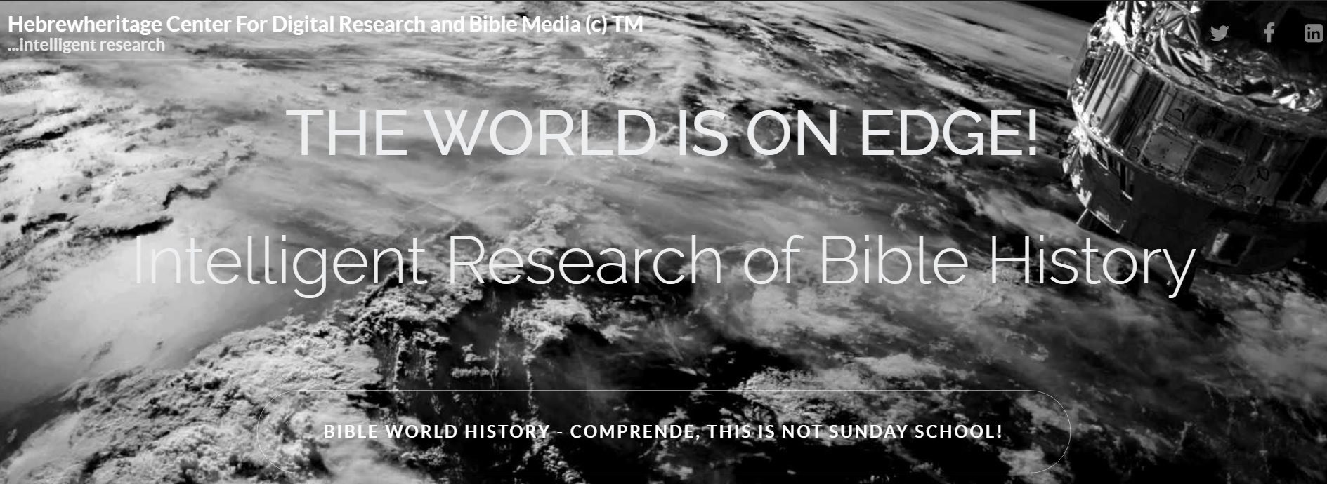
A SYSTEMATIC INVESTIGATION OF BIBLE TEXT
What We Already Know And what you do not

We have looked at Bible Text All Wrong
ADVANCED CURRICULUM FROM IN THE BEGINNING
Bible Text is a single Creator declared Prophecy called Good; as well as, a Redemptive Narrative. Bible Text is a consecutive linear stroryline, a Historiography of Prophecy from In The Beginning; not brief limited, Sound Bytes.
We Missed the Swarming Creatures Trilobites of Genesis 1:20-21. The Trilobite Fossil; caused the text to be looked at recorded; Chronology, Consecutive, Historic, Prophetic Bible Text
We Missed as the Prophet Daniel; also missed; the Storyline of Bible Literature.
Daniel Repented; Daniel 9:1-27. We Must!
Gabriel came to bring insight and understanding derived from the Book of Truth, as answered prayer; to be tracked through the course of human time periods from 605BC, forward.
Daniel 9:21- 24
We Missed Prophetic STORYLINE From Book of Truth Presented to the Prophet Daniel
Spirit of Truth, found in John 14:16-17, John 15:26-27, and John 16:12-13; 1 John 4:6.
We Missed Revelation 19:10b Testimony Prophecy of the Anointed Christ; crucified; cut-off at the prophetic 69th Week, current and returning; Masiach-Messiah in the Kingdom of the 70th Week.
Solid, Scripture-based evidence chronologically consecutive Gentile periods, which fulfills the Gentile Age.
Cosmic James Webb Space Telescope | Terrestrial Surfacing Bible Archaeology | Prophetic Storyline 
BIBLE INTEREST@ BIBLEFORCEACCESS
BIBLEFORCEACCESS WE PROVIDE RESEARCH INSIGHT
Facebook 16,063,228 people like this
b15,997,982 people follow this
Interest
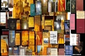
• 23 Year Research
• Curated 500 Book Library Collection
• In Country Research Israel, Macedonia, Rome, Albania, Bulgaria, Greece
BIBLEFORCEACCESSS METHOD – USED BY SIR ISAAC NEWTON IN 17TH CENTURY


A UNIQUE BIBLE EXPERIENCE, THE STORYLINE
BIBLEFORCEACCESS(c) 2023TM
We make the research, review of extremely complex Hebrew Bible Literature; manageable, linear, complete; a storyline through the course of Bible History Genesis 3:15
Creation| Sabbath Rest| The Garden Experience| Anti-Diluvian | Pangea | Flood | Diluvian
The Redemption Remedy, The Record of The Word of God.
We Connect the Bible with the Educational World through the Sciences, by which the Universe Earth the spoken creatures; water and dryland; and the Star Dust Created Homo-Sapien, DNA, God Breathed Human, exist; Sciences, via Bible and Prophecy!
BIBLE KNOWLEDGE MATTERS! …If it is written, then we should know it; Anti-Diluvian; Diluvian. CONSECUTIVE SEQUENCE OF BIBLE PROPHECY CAPTURED IN BOOKS BY TOPICAL SUBJECT MATTER
The Universe Explained, Colan A. Ronan; EARTH An Introduction To Geologic Change, Sheldon Judson; Genesis and the Big Bang, Gerald L. Schroeder; The book of Genesis, Grace Saxe; In The Beginning, Everett Fox; TRILOBITES, Smithsonian Institute The Sant Ocean Hall; Dinosaurs, Dowsell, Malam, Mason, Parker; Creation and Evolution, Norman Dennis Newell; The ICEMAN, Don Lessem; Ancient Civilizations 3000bc -500ad, Time Life Books; Masada, Yigael Yadin; Pompeii and Herculaneum, Mortimer Wheeler; Alexanader of Macedonia, Peter Green; Byzantine, A History, John Haldon; Mohammedanism Hamilton Gibb, MOHAMMED Encyclopedia Britainica 1857; Ockley’s History of the Saracens; Ottoman Empire Norman Itzkowitz | The Jewish State Theodor Herzl, The Message of the DEAD SEA SCROLLS Yigael Yadin, JERUSALEM SACRED CITY OF MANKIND A HISTORY OF FORTY CENTURIES Teddy Kollek & Moshe Pearlman, WORLD TRADE CENTER The Giants That Defied The Sky Peter Skinner’ …New York SEPTEMBER 11 Magnum Photographers excerpted: MORE
UNDERSTAND BY THE BOOKS! Hebrewheritage.mobi
You Do The Work!
LEARN MORECOMPELLING EVIDENCE
“The new finds show that the city of Gath peaked in power much earlier than researchers had believed. This is consistent with evidence found in other locations that connect to the early history of Israel recorded in the Bible. Patterns of Evidence has found that many scholars have grown skeptical of the biblical account because they aren’t looking far enough back in time to recognize the matching evidence.”

EDUCATION STUDIO
VITAE BIBLE LITERATURE
DIGITAL RESEARCH
POLYMATHIC BIBLE HISTORIOGRAPHERS
Goal: Do Exactly As Daniel Did Once Realizing He Did Not Know; He Like You Had Missed The Words of Jeremiah 25 & Jeremiah 26x Jeremiah 7-8-9:26;sounds like Israel exile Holocaust-September 11; October 7
The Beginning, Middle and Closing Experience of the Testimony of Hebrew Scripture. Based on the Hebrew, Aramaic Dead Sea Scrolls; the greatest archaeological discovery in Human history!
Professional Coaching


The Heavens Declare His Glory & The James Webb Telescope Helps Us See It
COSMIC Tanakh 1917, PSALM 19:1-14
For the Leader. A Psalm of David. The heavens declare the glory of God, And the firmament showeth His handiwork…
In the history of science, deep time is a relatively recent discovery. Generally, what we mean by deep time is geological time or cosmic time, in other words: billions of years. Excerpt NASA. Astronomers estimate that the big bang happened about 13.5-8 billion years ago; the James Webb Telescope discoveries will define actual Universe Time, looking backward.
Illustris MIT Previous To James Webb
Note: verse 14 The Rock is YHWH/God/G-d; not Apostle Peter.

1.8 Million Years Ago
pleistocene evolution 1.8 million years ago; Rhinoceroses https://en.wikipedia.org/wiki/Chauvet_Cave

Just In!
Out of Africa Theory Changed
An analysis of a 1.5 million-year-old vertebra from a human relative
Out of Africa was never Biblical, Earth was still Pangea Until Time of Peleg; Genesis 10:25 and 1 Chronicles 1:19, it was during the time of Peleg that the earth was divided; into present Continents. Mt Ararat is North at Humans are only God Breathed Homo Sapien Sapien Great Ararat, or Büyük Ağrı Dağı, which reaches an elevation of 16,945 feet (5,165 metres) above sea level, at Coordinates 39°42′07″N 44°17′54″E[2]
Pangea Earth.
Ancient Patriarchs up to Peleg; walked on Pangea Earth; then the earth divided

BIBLE CONTENT RESEARCHED
The Trilobite | The Bible
Bible Historiography Education Linear View, Consecutive Events Chronologic Sequence
Our Bible Curriculum work starts at In The Beginning. It is Comprehensive; designed as a rolling Curriculum, which flows through both Universe and Earth Time. The Licensed Material is not to be complicated, yet it is comprehensive.. The mobile digital is your own experience in truth by the Books. The Ancient prophets looked at books, teh Bereans and Essences curated and collected the known books of the first century, refreshed, sealed and hid the books for a future generation; ours. The Hebrew Bible in all educational messages is narrated by the Arch Angel Gabriel. He tells Daniel your prayer, Daniel chapter 9; was heard in Heaven; I have come to Give you insight, from the Book of Truth… The insight proves to be linear, consecutive, chonologic. Events of Gentile Kings, Kingdoms, Empires, Peoples, Nations.
The Hebrewheritage BIBLEFORCEACCESS Curriculum follows linear chronlogical real time, events; from; In The Beginning to the Hebrew Book of Revelation.
Daniel learned; Gabriel’s method of Study Research. Gabriel’s narrative, I have come to show and give you insight. You Daniel are present in (1)Babylon; I and Michael are fighting (2)Mede-Persia; and Greece will come. (3)Greece Came; then (4)Rome; then Rome (5)Byzantium, (6)Mohammed; Turks-Musselman-(7)Ottoman Empire Caliphate, (8)Islamic Republic Caliphate.
The Ottoman Empire; seized the last standing church of the
7 Churhes of the Book of Revelation.
WWI took out the Ottoman Empire; while the 10 Kingdoms are derived from the Allies of the Sykes-Picot and Balfour Declarations.
WE MISSED THIS!
Daniel had missed the words of the Prophet Jeremiah, in view of the restoration of israel to their land; ending Babylonian Captivity; regarding the 70 Weeks. Daniel is taken into Babylonian Captivity; Jermiah remains in Jerusalem. Hebrew Daniel, instructs both the Babylonians and Persians; in Hebrew Prophecy; while in Captivity under both Nebuchanezzar and Cyrus the Great.
The literal result; 600 years later is the 3 Achaemenid Wisemen entire the Bethlehem Story. The Persian Kingdoms, relating to the dynasty ruling in Persia from Cyrus I to Darius III (553–330 BC under Cyrus The Great; 3 Achmenid Wisemen: the dynasty ruling in Persia from Cyrus I to Darius III (553–330 BC), journeyed to Bethelem, when they saw the Prophetic Star. The 3 Wisemen are the first to follow the Hebrew teaching concerning the Hebrew Virgin Birth. Prophet Daniel; taught Micah – Bethlehem Ephratha, taught Isaiah – Nehimiah His name would be called Immanuel, the Hebrew Promise to Abraham, Isaac and Jacob; and the Genesis 3:15 declaration of how it would all play out in the Old Testament. Jeremiah provides the New Covenant Testament of the Heart; Jeremiah 31:31. The Covenant, begins to playout with the Announcement of the Anointed Christ and Baptism of the Nazarene by John the Baptist.
The Trilobite | The Bible
The Trilobite | The Bible
INSIGHT INTO BIBLE BOOKS REQUIRED TO TRACK BIBLE PROPHECY; FULFILLMENT BIBLICAL TIME
EDUCATE
BibleForceAccess(R) Licensed Material Contact Is LinkedIn You Can Find Us On Facebook
A service to the research study of Biblical Literature
LEARN MORE
Scripture | Science | Prophecy
We Provide Reference to Biblical Historical Material; Including Scarce, Rare or Unpublished
WE BUILD CURRICULUMS
Center For History and Bible Media
We are Forensic Bible Researchers, we reference 1st century original Dead Sea Scrolls
WHY YOU NEED TO KNOW!
Prophetic Predictions Unfolding Before Our Eyes
PROPHECY Fulfilled 70AD, the Tenth of AV
Matthew 24:1-3, Not One Stone Left On Another
The events of Oct, 7; Sept. 11, 1967; 1948; 1947; 2nd World War; the Holocaust; 1st World War; in regressive backward progression as a result of 1st century, Matthew 24 discourse titled the Great Olivet Prophecy; The Destruction of Jerusalem predicted, fulfilled, 70AD, when Jerusalem was destroyed by the Romns under Titu; & 25; the initial event prredicted; the Destruction of Jerusalem and Second Temple as predicted; Daniel 9:26 And after the sixty-two weeks, an anointed one shall ube cut off and shall have nothing. And the people of the prince who is to come vshall destroy the city and the sanctuary end shall come with a flood, and to the end there shall be war. Desolations are decreed. Matthew 24:1-3 Prophecy: the Scupture Snapshot-Artifacts from 2nd Temple carried off by Titus Roman Soldiers in Roman garment; these are not Hebrews. All Artifacts currently disputed; held at the Vatican.

The TRILOBITE Changed How We Study Biblical Text
From In The Beginning
Biblical spoken created animals; have survived the Fossilization process; intact. Such is the case of the Genesis 1 Trilobite,extinct; the Job Mammoth,extinct; the remnants of the Noah’s Ark Floodintheremaining debris of the Grand Canyon; and the Current, made in God’s Image 70 Living Nations of Earth,from the sons of Noah; birthed by
Shem Ham Japheth, each preserved by DNA, Biomolecule; ancient and current, Paleobiology. Ancient DNA, including entire ancient and current Genomes. The source of Animal Evolution at the molecularlevel and Human Homo-Sapien, God-Breathed Stardust.
Trilobite
Genesis 1:20-22 Current https://www.haaretz.com/israel-news/science/2023-10-24/ty-article/paleontologists-deduce-what-a-trilobite-ate-for-lunch-465-million-years-ago/0000018b-620c-ddfd-a59f-e3ec3a860000
Wooly Mammoth
AniLorem ipsum dolor sit amet, consectetur adipisicing elit.
Flood
In The Sediment
70 Nations
Table of 70 Nations
The Trilobite | The Bible
Discovery That Changed Everything!
…the Trilobite FOSSIL changed how we study
Bible Text
Artifact Fossil Evidence
Bible Research
Genesis 1:20-21, 5th Day; Swarming Water Creature of Bible text; clear evidence of Bible Truth.
Scientific study shows the Trilobite is without a parent, no previous father-no previous mother… just as spoken
The Swarming Trilobite; is as Spoken In Bible Text. Today the Trilobite has been discovered on every Continent on Earth.
The Trilobite Fossil, order books and specimens on Amazon, Ebay, Smithsonian
The earliest known Prophecy Element Artifact
The Trilobite Fossil


Trilobites are a group of extinct Marine Arthropods that first appeared around 521 million years ago, shortly after the beginning of the Cambrian period, living through the majority of the Palaeozoic Era, for nearly 300 million years.
Universe, Earth, Human Man
Bible Historiography Investigation of Bible Text
Cambrian Period | Ordovician Period | Silurian Period | Devonian Period |Carboniferous Period | Permian Period
Anti-Diluvian Super Continents; Pangaea : Laurasia and Gondwana Earth, Cambrian explosion 542 million years ago captures the transformation, 510 million and 200 million years ago, 65 million Year ago Mass Extinction, Trilobite and Other Fossil Evidence remained as Artifacts of Time. Today we live on the result of the immense break up of Pangea; through earthquakes, etc., forming present day Continents; the Bible tells us continent re-structure ended at the time of Biblical; Peleg, son of Eber,
Genesis 10:25.b.

HEBREW BIBLE HISTORIOGRAPHY
Complex Storyline of Time in the Kingdom; from Genesis 3:15 to Present Prophecy Fulfilled In The Aions Covenant Ages, Apostelic Age & New Testament begins with Jeremiah’s 31:31-34 prophecy,
Current Restoration of All Things Age, begins when John Prophecies ‘Again, Complex Storyline of Time in the Kingdom; from Genesis 3:15 to Present Prophecy Fulfilled In The Aions Covenant Age, Apostelic Age begins with Jeremiah’s 31:31-34 prophecy, Restoration of All ThingsAge,begins when John Prophecies ‘Again, for the servants; for the purpose of knowing Things which will shortly come to pass, AD96. Revelation 1:1-4; Luke 11:28
LINEAR BIBLE STORYLINE, CAPTURES THE CONSECUTIVE SEQUENCED BIBLICAL VISION OF PROPHETIC EVENTS, HISTORIOGRAPHY; CURATED WORD, SEALED, HIDDEN SCROLLS IN JARS OF CLAY; RISE FROM THE DESERT TO TELL ITS UNSEALED STORY. THE DEAD SEA SCROLLS DISCOVERED, CURATED, TRANSLATED, AVAILABLE: SCROLL BOOKS, ARAMAIC|HEBREW MANUSCRIPTS; TOPICAL, CHRONOLOGIC, HISTORIC, SCIENTIFIC, PROPHETIC SUBJECT MATTER… IT IS A DEPOSITION OF THE WORKS, PLANS AND PURPOSES OF A HOLY GOD… IT IS HEBREW BIBLE HISTORIOGRAPHY AND THESIS OF GOD’S DEALINGS WITH MANKIND
BIBLE PROPHECY EMPIRES, MONARCHS, END OF DAYS EVENTS REVELATION REVEALED, 10 BIBLE KINGDOMS RESULT OF OTTOMAN DEFEAT AND BRITISH AND FRENCH MANDATE PARTITIONS AFTER WWI 1914-1932, PSALM 83 ENEMY COUNTRIES| FOREVER IDENTIFIED AS 911 PARTICIPANTS BABYLON | PERSIAN | GRECIAN EMPIRES | BETHELEM 4BC 3 Wise Men, Persian Iranian descendants of 7th century BC Daniel, Persain court students of Hebrew Bible Text; arrived in Bethlehem based on the Hebrew instruction of Daniel; quoted as looking for, “the King of the Jews”, known to Herod as the Christ or Anointed One, not knowing the prophecy birth location, the Star guided …Daniel taught Micah 5; Bethlehem Ephrathah as the location concerning the Virgin birth of Isaiah 53; the sign of the Star, as 1st century birthplace of the conquerer ruler of Israel; the Anointed One. ROMAN EMPIRE | 70AD DESTRUCTION OF JERUSALEM | BYZANTINE EMPIRE | MOHAMMEDAN EMPIRE | RASHDIN CALIPHATE DYNASTIES | OTTOMAN EMPIRE | WWI 1914-1917 WOUNDS EMPIRE | CREATES 10 KINGDOMS OF BOTH DANIEL AND REVELATION, VIA THE BRITISH AND FRENCH MANDATE PARTITIONS AFTER WWI 1922, PSALM 83 | WWII 1939-1945 | HOLOCAUST | DEAD SEA SCROLLS DISCOVERY 1947 | ISRAEL NATION IN A DAY 1948 – PROPHETIC RESTORED LAND – PEOPLE – PROPHECY, RESTARTED PROPHECY COMPLETION TO THE ARMAGEDDON FINAL CONCLUSION FUTURE | 1967 SIX DAY WAR | ISLAMIC REPUBLIC CALIPHATE 1979 KHOLMEINI REVISED OTTOMAN CALIPHATE – THE 7TH THE SAME AS THE 8TH | MIDDLEAST ISLAMIC STATE 1922 TO PRESENT ARAB CONFERENCES HELD BY SUBMITTED CALIPHATE AGAINST ISRAEL, FIRST PEACE PEACE, THEREAFTER ARMAGEDDON | 911 IDENTIFIED TERRORISM OF 10 – 7 NATIONS OF DANIEL, REVELATION AND PSALM 83 | SEPTEMBER 11, 2001, FOREVER IDENTIFIED THE 20 REPRESENTATIVE WICKED OF HOLY SCRIPTURE # 20 DETAINED NY BORDER FROM CANADA | THE KINGS, KINGDOMS, HEADS, FROGS AND LOCUSTS OF CURRENT 21ST CENTURY GEO-RELIGIO-POLITICO-GLOBAL TERRORISM
CREATION-SABBATH/REST-ADAM-OUTSIDE-GARDEN-ADAM-INSIDE-GARDEN-EVE-FALL-3 CURSED- 3 OUTSIDE GARDEN ADAM, EVE, SERPENT/LUCIFER-CAIN-ABLE-CAIN MURDERERED ABLE-CAIN PROTECTED FROM NEANDERTHALS–SETH 4000BC THE GENERATIONS OF ADAM-SETH TO PRESENT-NOAH-THE ARK-THE FLOOD-ANTI-DILUVIAN AGE ENDS-ARK GROUNDED ON PANGEA DILUVIAN AGE BEGINS NOAH-SHEM-HAM-JAPHATH-70 NATIONS OF EARTH-BABEL DISPERSION-TO CALL OF ABRAM FROM UR-TO CALL OF HEBREW ABRAHAM FATHER OF MANY NATIONS-ISAAC-JACOB’S LAST DAYS PROPHECY-JOSEPH’S DEATH PROPHECY… and God will surely visit you and bring you out of this land to the land which he swore to Abraham, to Isaac, to Jacob. Hebrews 11:22
Understand How Prophecy Impacts Your
PROPHETIC REALITY
Daniel Decoded | Revelation Decoded | Prophecy | Last Days End Days Prophecy | End Gentile Times Prophecy | Genesis Hebrew Prophecy | Armageddon Prophecy | End of the World Prophecy | Deuteronomy Moses Prophecy|
You Do The Work

Plague Pestilence
Matthew 24:31
Pathogenesis: A History of the World in Eight Plagues Hardcover – April 18, 2023
by Jonathan Kennedy

Wars and Rumors
Genesis 3:15 x Revelation 6 Dake’s Annotated Bible; verse 1
Daniel’s 70th Week and the Tribulation. Gentile Time 42 Months; 1st Seal Rise of Anti-Christ Rev 6 x

Join On LinkedIn
10 Kingdoms of the Apocalypse
The 10 Kingdoms, 10 Horns created from break-up of Ottoman Empire Caliphate State
World War II 1939-1945 | 1948 Isaiah 66:7-24 THE NATION OF ISRAEL Prophecy Fulfills | 1948 NEXT DAY ATTACKED BY 5 ARAB LEAGUE ARMIES Prophecy Fulfills | 6 DAY WAR 1967 | 1979 ISLAMIC REPUBLIC CALIPHATE STATE REVIVED BY AYATOLLAH KHOMEINE REVELATION 13 OTTOMAN SEA BEAST 666AD, GIVES POWER TO EARTH BEAST Prophecy Fulfills | BIBLICAL EARTH BEAST LED BY OSAMA bin LADEN ALQAEDA MILITARY SYSTEM MANUAL the 8th; the same as the 7th Revelation 17:3-17 Scarlet Beast – 7 Heads are 7 Kings, 7 Hills & Ten Horns.
5 have fallen Babylon, Media Persian, Grecian, Roman, Mohammedan
One is Roman
One has not yet come as of John’s time period; history states Byzantine Rome was conquered Saracen Islam at the time of Khalif (Caliphate) Omar | the Constanines | the Macedonians, the Turks, Mongols Genghiz Khan, Ertogrul succeeded in 1280 by son, Othman 1299 Sultan, 1308 conquered the Independant Christian from the first century; the Seven Churces who received biblcal scrolls of Revlation Ephesus, 1373 Murad I, Mohammedan fanatic took Philadelphiain 1379. Both Ephesus and Philadelphia, the last indepndent imperial cities of Asia Minor; two of the 7 Churches of the Book of Revelation records what the Spirit says to the Churches Ï am coming soon. Hold on to what you have, so that no one will take your Crown”, Crown taken in 1373 by Isalm/Murad I, followed by Smyrna taken by Timur, Turkish conqueror. The events fulfill the warning of Revelation 1 & 2. Latter the Islamic Empire would take Bethlehem as, world-wide Christians abandoned Bethlehem to wicked radical Islam.
1440AD; the last Siege of Constanantinople | BYZANTINE EMPIRE https://en.wikipedia.org/wiki/Manuel_II_Palaiologosto Emperor Constantine
The Islamic Otttoman Caliphate Religious, Government State to the present. The Scarlet Beast in multi-forms; 1st Four Caliphate, …today, the Islamic Republic Caliphate State founded in 1979 by AYATOLLAH KHOMEINE, Iranian-Persian Caliphate; Foreign Policy SUBMISSION OR DEATH. KHOMEINE died June 3, 1989, Tehran, Iran;
Succeeded by Ali Khamenei
Succeeded by Akbar Hashemi Rafsanjani
Succeeded by Mohammad Khatami
Succeeded by Mahmoud Ahmadinejad
Succeeded by Hassan Rouhani
7th President of Iran Hassan Rouhani,
Twelver Shia
| 1993 YOM KIPPUR & 93″ WTC BOMBING | BUS BOMBS ISRAEL | SEPTEMBER 11, 2001 | 911 WTC & PENTAGON, SHANKSVILLE | 2015-2016 BIBLICAL LOCUSTS-HOME GROWNGLOBAL TERRORISM REVEALED BY ATTACKS IN PARIS; BRUSSELS … Many Have Gone Unnoticed
HEBREWHERITAGE CONTENT MANAGEMENT SYSTEM ©™ KNOWLEDGE MATTERS! … If it is written, then we should know it..
CONSECUTIVE SEQUENCE OF PROPHECY CAPTURED IN BOOKS BY EACH SUBJECT MATTER TOPICAL PROPHECY
The Universe Explained, Colan A. Ronan; EARTH An Introduction To Geologic Change, Sheldon Judson; Genesis and the Big Bang, Gerald L. Schroeder; The book of Genesis,Grace Saxe; In The Beginning, Everett Fox; TRILOBITES, Smithsonian Institute The Sant Ocean Hall; Dinosaurs, Dowsell, Malam, Mason, Parker; Creation and Evolution, Norman Dennis Newell; The ICEMAN, Don Lessem; Ancient Civilizations 3000bc -500ad, Time Life Books; Masada, Yigael Yadin; Pompeii and Herculaneum, Mortimer Wheeler; Alexanader of Macedonia, Peter Green; Byzantine, A History, John Haldon; Mohammedanism Hamilton Gibb, MOHAMMED Encyclopedia Britainica 1857; Ockley’s History of the Saracens; Ottoman Empire Norman Itzkowitz | The Jewish State Theodor Herzl, The Message of the DEAD SEA SCROLLS Yigael Yadin, JERUSALEM SACRED CITY OF MANKIND A HISTORY OF FORTY CENTURIES Teddy Kollek & Moshe Pearlman, WORLD TRADE CENTER The Giants That Defied The Sky Peter Skinner’ …New York SEPTEMBER 11 Magnum Photographers excerpted: MORE
UNDERSTAND BY THE BOOKS! Hebrewheritage.mobi
Follow Us on Social Media
If You Miss This You Miss it All
Enoch is recorded in Genesis Lineage also in the Book of Jude as the 1st Earthly Prophet
Enoch’s Scrolls are found in the Dead Sea Scrolls Collection Qumran Caves, Israel.
Flood; Noah Shem Ham Japheth | 70 Nations | Anti Diluvian Diluvian Peleg Genesis 10:25
Abraham Isaac Jacob
Isaiah 1-66 contains everything, Genesis to Revlation
Jeremiah 31:31 New Covenant of Heart
Daniel 9 Repentance
Ezekiel 37 & 38 Dry Bones
Zechariah 14 A day of the Lord is coming
Virgin Birth Womans Seed
3 Wise Persian Men taught at the courts of both Cyrus and Darius 1st Royalty to enter Bethlehem Ephrath, 600 years later based on their fathers lessons which they retained and acted on, in the 1st century; gifts and honor to Immanuel; God With Us. The Achmenid Wisemen learned from the Hebrew Book of Isaiah.
JOHN THE BAPTIST Announcement
Destruction of Jerusalem – Titus Arch
Destruction of Jerusalem
REVELATION 1 To The Servants; in the context Revelation the Book; is known by the servants
With The Above Points Intact You Will Comprehend Revelation, The Book; with ease.
1947 The Dead Sea Scrolls Discovered In The Judean Desert, Bedoins, Archaeology, Systematic Curation
New Insight on Bible adchaeology Palaeography, Old Testament Text, Jewish History and the Bible World In the 1st Century. Sytematic comparison produces 500 comparisons between the Dead Sea Scrolls and the New Covenant Testament. See the writings of But, Lawrence Schiffman, and James VanderKam, by permission. Geza Vermes and Charles F. Pfeiffeer. The Dead Sea Scrolls were curated by the Essene Community, with terminus ad quem dating by Department of Antiquities of the Kingdom of Jordan and the Ecole Biblique of Jerusalem, 1951-1955.
The Dead Sea Scrolls and the Originality of Christ, Geoffrey Greystone 1956
CURATED EVIDENCE
IF YOU REALLY WANT TO KNOW! Synopsis for the Heavy Hitters
Brief Survey
Hebrewheritage.com …a systematic Investigation of Biblical Text. Welcome to the official internet publication of Hebrewheritage.com WE HAVE JUST, EXPERIENCED, THE SHAKING (Sifting, Isaiah 30:28) OF ALL THINGS THAT CAN BE SHAKEN . ALL THE IDOLS WHICH MEN CLING TO HAVE BEEN TESTED; THE STOCK MARKET, 401K PLANS, BANK ACCOUNTS, THE ECONOMY BOTH NATIONAL AND GLOBAL, THE HEALTH CARE SYSTEM, GOVERNMENT, RELIGION AND ALL ELSE THAT WE TRUST FOR COMFORT, SECURITY AND SAFETY, HAS BEEN SHAKEN; ONLY THAT WHICH CANNOT BE SHAKEN; PROPHECY, WILL STAND …excerpt, “The Remnant Bride by Joseph Herrin http://philologos.org Investigated carefully, scripture predictions contain prophetic world history; as predictions are accomplished, others unravel to a clear and discernible chronological outline; episodes of multiple, extraordinary and improbable events, …by tracing chronological history of geological time, eions, eras, epochs, periods, cycles and dates with specific characteristics. The law enforcement background this author, looks at every word of scripture and every prophetic event as evidence, systematically investigating every statement of fact and historical account. THE EVENTS OF BIBLICAL HISTORY AND SECULAR HISTORY ARE CONNECTED s. The events leading up to and including September 11, 2001; which affected the entire globe in biblical proportions, have enabled the un-sealing of biblical text in the 21st century. This has enabled the course of history to identify the wicked (Rasa, denotes evil thoughts, words and deeds which are contrary to God’s character, a lifesytle which is completely contrary to the Laws of God). Resa, Risah; the evil characteristics of the end days Axis of Evil, present at the End of the Age, not world; spoken of in the book of Daniel. History will continue to identify fulfillment of prophecies until the last event occurs, ending the period of Grace, known biblically as the “Time of the Gentiles”, at that time the Bible declares the wise will receive the allotted inheritance …Hebrewheritage. “Let your evidence lead you where it will.” Millar Burrows In his preface, Dr. Finis Jennings Dake wrote, “The purpose of this work is to give in one volume the helps a student of the Bible needs from many books (points of evidence, investigated proper). Bible Commentaries, Atlas, Dictionary, complete Concordance, Dispensational Truth, Topical Text book, Bible Synthesis, Doctrines, Prophetic Studies (by various authors such as Sir Isaac Newton), etc. Anyone who applies the same collegiate measures in their study of the Word (John1:1), will draw the same conclusions based on the evidence. Dake states, “In this way, the reader is invited to see for himself related passages in prophecy and history and will learn well the lesson of”, “rightly dividing the Word of Truth” 2 Timothy 2:15. Preface, Dakes’s Annotated Reference Bible by Finis Jennings Dake Mo’ed… A set appointed time Not the end of the World. The series of historic events prior to and including “911”, caused the sealed data of Biblical Text to open and unravel, by identifying the wicked who will “continue to be wicked, none of the wicked will understand, but those who are wise will understand”, beginning in the 21st Century. Daniel 12:10. The predicted time code was given as 21 Days, by natural bible standards 21 days indicating 21 years, 2001 years or the 21st century, signified by the used term “anno Domini”; from the Latin, literally “in the year of our Lord”, as prophesied by Isaiah. The event was scheduled to occur 21 days later as prophesied in the book of Daniel; the 21st century. THE HEBREW BOOK OF DANIEL, NOT AS WRITING BUT AS PROPHECY This view represents the Hebrew Book of Daniel, if you do not know and understand, this view, then you have not been like the biblical Berean, you have not studied Daniel, as commanded in Matthew 24:15, nor can you understand the book of Revelation or the time of His Coming; the time of the coming of Messiah. The Apostle Peter called the one who has not studied Daniel, “willfully ignorant”. 2 Peter 3:5. The reknown Jewish Rabbi Gamaliel (100ad) states regarding the apostelic events that, if it is from God, you will not be able to stop it (them) Acts 5:34-42. The extreme scholar Isaac Newton 1642-1727, researched the book of Daniel, charted it and wrote his now famous The Prophecies of Daniel and The Apocalypse (Book of Revelation) 1733ad. Watching and comparing events in the Middle-East with Biblical text Matthew 24:15 Biblical and World history in Eschatological (End of Age) Chronological View (Through the years of Secular History) Prophecy (The plan of God) of History incorporated in the Book of Daniel recorded in the Time Line 606bc to Present Measure carefully in your mind, and when you see that some of the predicted signs have occurred, then you will know that it is the very time when the Most High is about to visit the world that he has made. So when there shall appear in the world earthquakes (Tsunami), tumult of peoples (Wars), intrigues of nations (Islam), wavering of leaders (France, England, USA, Russia, UN, EU), confusion of princes, Jordan (Hashemite), Egypt (Egyptian, Iranian (Achaemenian-Persian), Saudi (Saudi Arabia), Syrian (Assyrian), Iraq (Babylonian); then you will know that it was of these that the Most High spoke from the days that were of old, from the beginning. For just as with everything that has occurred in the world, the beginning is evident, and the end is manifest (made reality); so also are the times of the Most High: the beginnings are manifest in wonders and mighty works, and the end in penalties and in signs. 2 Esdras 9, Acts 2:17-21, Joel 2:28-32, Matthew 24:15, Daniel 12, Enoch The First Prophet – The first Prophetic Book ….. The first Prophecy in all of history laid the foundation of all Biblical text after being summoned to Heaven to receive the message to be delivered to ALL mankind. All prophecies are a fulfillment of the Book of Enoch. The fulfillment of current Prophecies are found in the Book of Daniel; the outcome of All Prophecy is found in the Book of Revelation. DANIEL History of Biblical Text Related To the End of The Age The history of Nebuchadnezzar’s Dream The 4 Beast Empire Dream The Ram and Goat Vision The Seventy Sevens The Kings of the North and the South The End Times of the book of Daniel REVELATION The history of the 7 Churches of Revelation The Woman and the Dragon The Beast of the Sea The Beast of the Earth Second Intifada, erupted in the fall of 2000 Hosea’s 2 Days The Woman and the Beast The Fall of Babylon The Harvest NOT Rapture –Rapture will include both the Root (Judah-Two Tribes) and the Branch(Gentiles-Ephraim- The Ten Tribes),attached to it. This time period of events is known as the Time of the Gentiles which runs throughout the limited and temporal age of mankind, with particular emphasis on the current age of Grace. This is the End of the Age, not World. This did not occur at 70 ad, since John writing in Revelation 1 & 22,written between 71 and 100ad states: The words are trust worthy and true. The Lord. The God of the spirits of the Prophets, sent His angels to show His Servants the things that must soon take place. This means the events, would begin to happen after 100ad. Wars Famines EarthquakeS Pestilence The events of September 11, 2001 (911) unsealed the entire Prophecy of the books of Daniel and Revelation by revealing the end of days wicked, the seed of the serpent as declared in Genesis 2, in the Garden indictment and curse of the Serpent. Ancient Scrolls discovered at the Dead Sea in 1947, Decoded Ancient Symbols, Timed Measures and Historical Events related to History, Science and Biblical text, all correlate to reveal the scope of the one prophecy declared in the Garden, over periods, eras and ages (aions) to convey the characteristics of the original eternal plan. A systematic investigation of biblical text Chronologic, Historic, Geographic and Eschatologic Science Hebrewheritage.com connects the dots of Eras, Cycles and Ages culminating in timed events, to the systematic matrix of historical events through the sciences of Archaeology, Anthropology, Zoology, Botany, Architecture, Geology, Geography, History, Science, Topography, Ecology, Eschatology, Prophecy, etc. Thematic connections between Prophetic events in secular and biblical history, presented in graphic chronologic view. Isaac Newton, spent great effort on Biblical matters and Theology and with the fixing of dates in ancient history. Newton was interested in religious matters in the prime of his life; some of his peers stated he was more interested in religion than in science. Soon after writing Principia Newton was heavily involved in writing about the scriptures; he actively carried on correspondence on the prophecies of the book of Daniel. It is noted in a very large collection of papers that he wrote a million and a half words, enough to fill fifty books on religious and historic matters. One of the fifty books was, Observations on the Prophecies of Daniel and the Apocalypse (Revelation). In this book he first shows the relevance of the matter not by explaining the books of Daniel and Revelation, but by, reconnecting the breach between the Hebrew books actually in use during the times of the Prophets, Apostles and Disciples, the books which Ezra had successfully compiled, after being lost and forgotten through the times of both the fall of Samaria and the fall of Jerusalem. By referencing the compilers of the books of the Bible, Newton, connected the prophecies with subsequent history; for instance, the beast of Daniel has ten horns and there came up among them a little horn. Newton identified this horn with kingdoms, and accurately decided the little horn was the Roman Church in its age, as a Sea Beast, which is historically accurate and prior to Israel becoming a state again, in 1948, according to the book of Isaiah. According to biblical text, a little horn of unique description and attribute must appear and resurface as first an Earth Beast with different attributes from that of the Roman church. The most significant technical description and attribute which the Roman Church cannot fit is the number of the 666ad Beast; which is man’s number, it does not fit because again according to the Prophet Isaiah, Israel had to be in a state of nationhood. Within prophetic knowledge and understanding, the attribute must fit the principle character or event in its Aion (age reference), meaning its period of historic existence in conjunction to ALL the other scriptures which relate to it. It is the Islamic Empire which ruled under the Umayyad Dynasty in the year 666ad and to this day reflects all the attributes and characteristics of the other horn of Daniel 7. The most outstanding attribute and characteristic of this horn is that it meets the timed event criteria. This means every part of a particular prophecy is fulfilled as a whole, not as fragments, in its specific Moed, (prophetic set appointed time). Therefore all the parts of historic prophecy must be connected and strung together to reveal the entire plan of the entire prophecy fulfilled. Genesis to Revelation is one (1) continuous prophecy, begun in the Garden stretching across thousands of years, until its final fulfillment, in its Moed, Prophetic set Appointed Time. There is a time for everything, and a season for every activity under Heaven. The ministry of Hebrewheritage.com has been given the mandate to make known and understandable the knowledge of God, in the last Days. We believe we are part of the company of prophecy teachers (not prophets) which Sir Isaac Newton said, “will be raised up in the end time”. “About the time of the end, a body of men will be raised up who will turn their attention to the Prophecies, and insist upon their literal interpretation, in the midst of much clamor and opposition.” The fundamental principles of progressive revelation and interpretation are traced to historic fulfillment of prophecies symbolic of historic events throughout the History of mankind. The mandate is to trace the prophecy from its beginning in the Garden, at the time of the curse and publish the historic fulfillment of multiple prophecies fulfilling the One as declared in the Garden. Throughout the limited and temporal age of mankind. Particular emphasis on the age of Grace which began in the reign of King Nebuchadnezzar during the captivity of the Judean Israelites and proceeded forward though out the ages (aions) and dispensations assigned to each covenant between God and man. The age of Grace runs its course in the linear pattern of predicted history in the “End of the Age”, time periods of events, known as the Time of the Gentiles. a time to be born and a time to die; a time to plant and a time to uproot,… a time to search and a time to give up, a time to tear and a time to mend, a time to be silent and a time to speak, a time to love and a time to hate, a time for war and a time for peace ECCLESIASTES 3:1-2,6-8 The Daniel Code The book of Daniel begins with the study of human learning; God’s way of training up men in the way they should go. Oddly, diet played a part in their education. Though initially there were difficulties in understanding portions of the text, even for Daniel; history of various ages through various nations had to play-out to make the text intelligible. The text of Matthew 24:15 states …”let him that readth understand” then directs the reader to focus on the prophecies of Daniel; which is the answer to the question;” What Will Be The Sign of Your Coming”? Daniel and Revelation run analogous to each other; starting from 30ad to the 1335 days-event which ends the “Times of the Gentiles. Daniel relates historical events, past present and future; with concise deliberate minute detail. The book expects the reader to be skilful in wisdom and cunning or well-versed in knowledge; understanding the sciences and history in particular. Daniel spent 3 years in training in the Kings court; the disciples likewise were taught in the KINGS court this same span of time; many who wish to understand would do well to set a 3 year goal. The book of Genesis, directed its reader to look for the seed; we have established the seed of the woman but have never included the seed of the serpent in our search. Daniel was given the expertise to reveal clearly and in minute detail, who the seed is as well as who it is not. The Daniel code is a chronological timeline relating one period and event in history to another with the same goal in view as the man Gabriel had when he came to make Daniel skilful in understanding. Investigated carefully, scripture predictions contain prophetic Biblio-Scientific Timed Events in world history. As predictions are accomplished, others unravel to a clear discernible chronology of multiple, extraordinary and improbable events carried out in strategic timing. Timed-Events are the key to understanding prophecy through scientific analysis. Gabriel directed Daniel to look into the word which described a Timed-Events and he would understand the visual prophecy. Daniel 9:24 begins with timing. Seventy weeks(1) are decreed upon your people and upon the holy city (2) (Jerusalem) to finish transgression, and to make an end to sin (3), and to bring everlasting righteousness (4), and to seal vision and prophet(5), and to anoint the most holy place (Mt Zion NOT Mt Moriah in Jerusalem) (6). Six events must transpire in order to bring the world to the state of peace, which Adam, Eve and God enjoyed in the Garden. Daniel was able to understand the events of his time, the fact that there would be 1335 days future and that the fulfillment must wait till the end of the age (aion) to be unsealed. In actually fact, Daniel 9 begins with repentance verses 3-19; it is the foundation for understanding the Daniel Code and the Revelation of Jesus the Christ. At this point the thing to understand is; this is not about Israel, nor the people of the Middle-East; Bush, Blair, Oil or Gold; this is about God. PROPHETIC TIMES Epacts of the Prophetic Times as measured by the True Solar and Lunar Years and Epacts of the Prophetic Times as Measured by the Soli-Lunar or Calendar Year of 360 Days Septenary Periods This is the true code of both the book of Daniel and the book of Revelation, which Isaac Newton understood in the 16th century; then was confirmed and verified in the 20th century by H.Grattan Guinness and M. DE Cheseaux. The revelation of Jesus Messiah which which God gave Him to show His servants things that must happen soon Revelation 1, Daniel 2:28-29,45. He made known, when He sent His messenger to His Servant John who testfied what he saw, the Word of God and the Testimony of Jesus Messiah. Blessed is the one who reads and are those who hear the words of the Prophecy and keep the things that have been written in it, for the time is near. The Chronology of the Gentile Times Compelling Evidence of Prophetic Timed History Event Specific Prophetic Perspective “Seven Times” Seventy “sevens” (shabuwa) are decreed for your people and your holy city to finish transgression, to put an end to sin, to atone for wickedness, to bring in everlasting righteousness, to seal up vision and prophecy and to anoint the most holy (Daniel 9:24). In Hebrew shabuwa is translated “sevens.” Shabuwa means sevened, seven or a prophetic week. Seven Times Punishment A Prophetic time is 360 Years – seven such times is 2520 years. 1260 1260 = 2520 2520 Lunar years , plus 75 solar years, equal 2520 Solar Years Seven Times is 2520 Days, as well as, 2520 Years Seven Times is the penalty from God for Israel ‘s National Apostasy (7 Times x 360 Hebrew Days =2520 Solar, Lunar or Calendar days) The Week of which 1260 years is the half, is 2520 years Biblical Text is Dated in Four ways Solar, Lunar, Calendar and Prophetic Chronological Measures begin in Genesis 1, based on Solar Lunar Calendar Prophetic Critical Dates, Eras, Years 2520 Solar 2484 Calendar 2445 Lunar 1260 days 1242 days 1222 1/2 days 365.25 days Solar 354 days Lunar Time = 360 days = 360 Day Cycle of Time Times = 720 Days half = 180 days _____ 1260 days By Soli-Lunar or Calendar year measure Thrice six calendar years, and thrice six weeks; or 6606 Days 666 Revelation13:18 1260 Years contains 66 Metonic cycles, plus 6 years Epact, 66 weeks of months, plus 60 days The number of the Beast Man’s Number 666 was yet to come Daniel Holy Spirit will tell you what is yet to come John16:14 42 Months x 30 days (Years) Genesis 7 & 8 = 1260 days Time, Times and a half Daniel 7:25, Daniel 12:7 30 Years = One Prophetic Month, Astronomically Thirty Years is a solar-lunar cycle in which the solar year and the lunar year agree within a day. 1260 days is equivalent to 3 1/2 TIMES, not 3 1/2 years Prophetic Scale ,”each day for a year” Numbers 14:34 & Ezekiel 4:6 Prophetic Time 1260 Sixty-Six weeks of months and sixty days 1260 days of Papal Domination (THE IRON) Revelation11:2 Revelation 11:3 Two Witness, The Two Olive Trees and Two Lampstand that stand before the Lord of the earth. 1 Witness = Hebrew Church established by Moses & 2 Witness = Hebrew Church established by Christ & Paul) Revelation 13:5 Revelation 12:6. Revelation 12:14Daniel 12:7 Daniel 7:25 1290 Days of Mohammedan Domination (THE CLAY) 1290 Days Daniel 12:11 1967ad ( The Six Day War) a 1290 Cycle 1335Days Daniel 12:12 Year/Day Prophecy September 11, 2001 = 2 Prophetic Days from Anno Domini Hosea 6:1 to 8:14 1335 Seventy weeks of months, and seven weeks of days 1335 A thousand weeks 1335 Yeasr contain 70 metonic cycles, plus 5 years Epact, 70 Weeks of months, plus 7 weeks of days The Epact in 1335 years is a Thousand Weeks, within a day 45 days more equals 1335 days in 2012ad 2012 The end of the Biblical Gentile Calendar 2012 The end of the Mayan Calendar 2300 Thirty-three solar years (The Sanctuary Cycle) 2300 Seventy lunar Years, and seven months 2520 Seventy-Five Solar Years 1000 Years A month of Solar Years Revelation20 1000 Twice seven years and seven months 3 Calendar Years Under Devine Law the time appointed for the presentation of Tithe Offering was the end of every three years, not each week. The 3 WOES of Revelation 8:13 Woe, Woe Woe to the inhabitants of the earth, because of the Trumpet blasts about to be sounded by the other three Angels. The 5th Rev 8:1 to 9:12 First Woe The 6th Rev 9:13 to 11:14 Second Woe The 7th Rev 11:15 to18:24 Third Woe Woe 1 = 70 ad Fall of Jerusalem Matthew 24:1-14 Revelation 8:1 thru 9:1-12 within Trumpets 1-5 Woe 2 = 1939-1945 Holocaust Revelation 9:13 thru 11:14 within 6th Trumpet Judgement Woe 3 = 1948 to Armageddon Revelation 11:15 thru 18:24Seventh (7) Bowl Judgement within 7th Trumpet Judgement After 2012ad Matthew Henry Commentary Bible Sir Isaac Newton Prophetic chart Bible and World History Chart James Hastings Bible Dictionay BibleBrowser.com Concordance The Approaching End of the Age …History, Prophecy and Science – H. Grattan Guinness Young’s Analytical Concordance Hebrewheritage …To restore David’s fallen Tents,To Repair its broken places,To restore its ruins,And to rebuild it as it used to be AMOS 9:11 (911)* Copyright and Trademark notice © 1994-2012 Hebrewheritage.com (TM) All rights reserved U.S. and International Copyright Law, Title 17USC92.1,§107. Non-Profit – Not a 301(c) all donations & offerings are considered personal gifts and may be taxed by your local and federal authorities. Advertise | Sponsor | Grants | Seminar | Book Conference | Book Trade Show | Blogger List | Author | Biblical Historian | Educator | Journalist | Chaplain | Scholar | Teacher | Biblical Research Consultant | The prophet Hosea echoes the same thouht in chapter 6 verses 1 -3 … Come, let us return (repent Hosea 14) to the Lord. He has torn us to pieces but he will heal us, he has injured us but he will bind up our wounds. After two days (2000 years, exactly the date of 911) he will revive us; on the third day (exactly the third of 3 – 2000 year-days, which began about the time of the Tower of Babel , Peleg-when the earth was divided (Genesis 10) and the original 70 nations; completing 6000 years of history; ending in sovereign rest from all labor, Sabbath Rest); retored to the state of Eden, that we may live in His presence. As you track the forensic historic evidence, both biblical and secular, truth is found by design; the pieces to the earthly drama connect together; simply because God required his Prophets to outline in great detail, the plan of Redemption. Humanity is called upon to journey on earth as a progression of historic events through the ages of Ages unfolds. By choice, the time piece used was the Hebrew nation; the land and people of Israel; fulfilling prophecy through the course of history. The redemption of all nations, all mankind, is based on the biblical text, seen through the sciences of: Archaeology, Anthropology, Zoology, Botany, Architecture,Geology, Geography, History, Science, Mathematics, Astronomy, Topography, Ecology, Eschatology, Prophecy, etc. Once the system is understood, the text of the Bible becomes reasonable and clear in identifying the signs of the times, the end of the age. Matthew 16:2-3 There has been but one prophetic religion in all of history, the religion of the Jews, initially a one God people, seeking God in His own appointed time and directed way, only by obedience to his wod. Matthew 24:15 the last major prophecy spoken by the Hebrew man known as Jesus of Nazareth, is the prophetic response to answer, 3 questions asked by His disciples, just prior to His death and ressurection. The questions were simple, time based and to the point; “When will Jerusalem be detstroyed, What sign will there be and What will happen at that future end of the age time. The critical answer set the stage for all subsequent disciples to find and understand the answers to three pressing questions. The response was not as simple as the question. The answer is found in Matthew 24:4-51, known as the Signs of the Second coming, most old testament prophets record a two stage coming of the Anointed One identified by different aspects and attributes of His character; 1st as a Lamb figure, meeking and entering Jerusalem on a donkey (Isaiah), as an Anointed One (Daniel 9:24), the text of which states the timing of the event, at seven weeks three score and two weeks; after threescore and two weeks Messiah shall be cut off, …the prince Titus will come and destroy the city (Jerusalem) and the santuary (2nd Temple); ALL OF WHICH HAPPENED AT 70 AD BY THE ROMAN ARMY LEAD BY GENERAL TITUS. Therefore, anyone who came after the set event time period making any messenger claims 500 years later, would be a False Prophet. (Daniel 9-10). 2nd as Lord Zechariah 14, Ezekiel 38-39, Joel 2-3, Isaiah 63:1-6. Isaiah 63 describes the 2nd coming in great detail; while Isaiah 53 describes the first. Please Note: In the seventh century bc, during the Judean Captivity, King Nebuchadnezzar of Babylon had a dream, Daniel one of may transported to Babylon, interpreted the dream. Daniel 2 describes the statue of the dream which are symbols of metal monarchies, Gold Silver -great empires which would playout in world history. The head of gold was King Nebuchadnezzar himself, followed by each subsequent conquering empire in history. The breast and arms of silver represented the Mede Empire and the Perisan Empire, the belly and thighs of brass was the famous empire of Alexander the Great, the legs and feet of iron signified the Roman empire, including Papal Rome. Finally would come a great stone from a mountain, not cut with human hands; a new everlasting kingdom. This is briefly the story the book of Daniel which conveys to us, Ages of time as human biblical history continues to unfold; stretching over 2520 years from the time of the original dream. The website is a unique visual compendium of historic and prophectic events demonstrating thematic connections to world, political and religious events, fulfilled by history, as the event relates to the nation of Israel. Matthew 24:15, The book of Daniel The entire fulfillment of ALL Bible Prophecy. One born in the 6th century ad, is prophetic, however that one is connected to the troddening down of Israel and the Abomination standing in the designated outer court of the Holy place (Ezekiel ; Revelation11:2; not at the place of the Holy of Holies within the confines of the Temple area proper.iel Revelation 11:2 …But exclude the outer court; do not measure it, because it has been given to the Gentiles (Islam). This was accomplished in xxx when ___ handed over Jerusalem to Omar the xx Caliphate from Mohammed. People of Islam continue to hold rule over the people in their trodden down state but not over the land, which since May 14, 1948 has blossemed. However, the arm of Islam will continue over the people until Armageddon. The prophecy states the Messiah must set foot in Jerusalem (Zechariah14:4), to save His people while they are in a returned state from dispora, to the land of Israel; and from the return of physical captivity; to the restoration of all twelve tribes; from this, they will never be removed nor pushed or be blown into the sea. The events of Mathhew 24 have 25 prophetic signs, beginning with the destruction of Jerusalem in 70ad; which is included in the first 8 signs known as the beginning of Jewish sorrows, the next eight signs during the sorrows of Israel, a time when both houses of Israel were scattered from the land of Israel for 1878 years; the 17th sign: the Abomination of Desolation; the 18th sign: the process of the, “troddening down”, of Israel by Anti-Christ; the 19th:sign the Great Tribulation; within the Great Tribulation are 6 signs. Finally, ending with the battle of Armageddon, foretold in explicit manner by the Apostle John in the book of Revelation. How the armies are destroyed at Armageddon is found in Zechariah 14:12-15 At the 17th sign, the final instruction is given, “WHEN you see the, “Abomination of Desolation,” spoken of by Daniel, the prophet, standing in the Holy Place, whoever reads let him him understand. This sign could only be seen by a Hebrew/Jewishone only while they were once again resident as a nation, in the land of Israel. The 17th sign of the prophecy occurred on May 14, 1948; when after a 1878 year dispora (absence) the people of Israel were once again in the land of Israel and capable at that time of see the Abomination standing in the Outer Gentile Court of the 2nd Temple on Mt Moriah, the area Ezekiel was instructed not to measure. THIS ALL SOUNDS COMPLEX AND COMPLICATED; IT IS NOT, BUT ONE WILL HAVE TO PUT SOME EFFORT INTO UNDERSTANDING IT; THE ONE WHO SAVES HAD TO PUT SOME EFFORT INTO KEEPING HIMSELF PINNED TO THE CROSS. YOU MUST STUDY THE HISTORY OF DANIEL BEFORE YOU CAN UNDERSTAND REVELATION, THE GOAL TO UNDERSTAND THE FATHER’S PLAN. The site is a detailed panorama to assist in understanding the evidence of, “Event Driven World History“, as outlined in the book of Daniel. The reason the book is referred to in Mathhew 24:15 is because the events would be well future and history driven. The disciples needed to know this;as well as, present day disciples. Millions have been told not to read the book of Daniel or not to seek knowledge, or just reading through the text without understanding the storyline is enough. However, Daniel’s position is that knowledge of God will not puff up, but will make one wise in the Latter Days. The choice is to believe the Law and the Prophets (Matthew 5:17 ; 7:12; Luke 16:16-17). Or as some do you can believe that your local minister or pastorunderstand and belives for the both of you, which is totally inscriptural. The seriousness of this blemished thinking is evident when you consider, what generates from lack of knowledge and understanding; the perishing from this syndrome which God hates. The Tallit garment forms a prime example of this lack; known as the God designed prayer shawl of Numbers 15: 38-41. The text is titled blue ribbons or threads: a sign of obedience to the law and a calling to be a Holy people … “that you may remember the commandments and to be holy unto God,” and this law shall not pass away till every jot and tittle has come to pass. Ask yourself why has not minister, pastor or priest explained and instructed concerning the, Tallit. The garment God designed for each individual son or daughter, advising Moses to have the children of Israel make fringes for their garment (blue ribbons or threads). Those who believe in Christ Jesus should know He wore a Tallit each time He was in prayer as should all who are under the Mosaic Law which does not have the ability to pass away. Christ as Messiah will wear the garment to his wedding feast. In healing, the women with the issue of blood, recognized the garment and the one wearing it from her study of scripture; so indeed she touched the wing part of His garment knowing it had healing for her body. This women believed the Law and the Prophets, the question is do you. PERMANENT AND ETERNAL MOSAIC FEASTS . ..Zechariah 14:16-21 for all who call upon the name of the Lord will take part eternally in the Feast of Tabernacles/Sukkot Zechariah 14:16, New Moons, Sabbath Isaiah 66:23. This means we are responsible for knowing, Feast of Tabernacles – known as Sukkot/Booths/Harvest where the Jewishone asks God to be saved, a feast which will continue into Eternity. Great article at http://en.wikipedia.org/wiki/Sukkot Also Shavuot/Weeks, , occuring 50 days after Passover, which is known as the Day of Pentecost, a study to show yourself approved… gathering which will continue into Eternity, found at http://en.wikipedia.org/wiki/Shavuot Then there is Sabbath/Atonement, which the prophet Isaiah 66:22-23, records will continue into Eternity http://en.wikipedia.org/wiki/Sabbath . The Prayer over the Bread and the Wine, …modern day Communion The Isaiah Scroll …Isaiah 65:1 There is one other prevalent error, through lack of Knowledge which concerns Mt. Zion, NOT Mt. Moriah. Mt Moriah is where the Islamic Caliphate Omar built the original version of the Golden Dome in the outer court of the Second Temple; this building is called in biblical text a building standing where it out not. The word declares the Lord will reside in Zion, Mount Zion; which is a different hill location, then Mt Moriah. The simple error is most have not studied the geography; imagine having a blemish just because of not taking time to study geography. See http://en.wikipedia.org/wiki/Mount_Zion; aerial and land geography designates a specific location for Mt Zion, the south-east hill of Jerusalem; one of 5 hills; Akra, Bezetha, Moriah, Ophel and Zion on the mountain plateau. The Jebusites called it a fortress, after conquer it was known as, the City of David. Though the word Zion has been used in general to describe Israel and Jerusalem, there are longitude and latitude coordinates which designate the area. The facts can be found by searching a vintage map with topographical structure or by search on the Israel Ministry of Tourism website. One more vital point is, the Gate facing East at the Temple Mount ,…What belongs to God and what belongs to Evil …to be continued In this site we have included, The Carpenter’s Workshop it is an aid to identfy your spiritual maturity; a brief curriculum of foundational principles from the book of Hebrews and from 2 Peter 1:5-11, an odd combination of text but written by L. Ralph, to help identify your skill level in identifying biblical truth. The course is built on 4 principles: I. Skillfull in the Word of Righteousness, II. Additions to the Faith; III. The Kingdom’s Rule; IV. The Kingdom Reign, with an Introduction, The Importance of Balance in Spiritual Growth. The final question when one stands at the day of Judgment is have you accomplished that which God has called you to do; your pastor or priest cannot answer for you; you must give an account for yourself, did you accomplish what He told you in that still small voice; to this end it may be expedient to study 1st and 2nd Timothy and the book of Titus. THE SEALED BOOK OF DANIEL HAS BEEN UNSEALED, BY THE EVENTS OF SEPTEMBER 11, WHICH IDENTIFIED THE WICKED OF DANIEL CHAPTER 12. REVEALS AND UNLOCKS THE TEXT OF THE BOOK OF REVELATION; WHEN CORRELATED WITH THE BOOK OF DANIEL. THE APPOINTED TIME IN THE TWENTY-FIRST CENTURY WAS PREDICTED BY THE ANGEL GABRIEL. Daniel in his book, states the wise, in the Last Days, will understand; the text of the book is presented in timeline format; when the text is traced in light of historic events, understanding and meaning become plain and clear. This is why so many who tried to set dates were in error, since many events had not reached their historic time. This is also why so many cannot understand the book of Revelation; since where Daniel end s at chapter 12, Revelation continues the events at chapter 11. So it is in Daniel, the beginning of the, two tribe nation of Israel entering the Gentile world through the Babylonian (Iraq/Iran) captivity starting the time clock of the present prophecy and all prophecies attached to it. The prophecy interpreted by Daniel is of the dream of the Babylonian King Nebuchanezzar (Daniel 2:1-48); the end time drama will continue until the historic event that will the temporl timeline of the dream and the present Islamic captivity of the world in the; “Times of the Gentiles; the 1260, 42 months, 2300 evenings and mornings,1290 and 1335 Days/Years of scripture. The book of Daniel states, knowledge would increase, the acquistion of true knowledge as one (1) Truth; TORAH. The inevitable conclusion that there is but one true God, who is the God of the Hebrew. Deuteronomy, the fifth book of the Bible declares, “choose you this day the blessing – Deuteronomy 28:1-14 or the curse – Deuteronomy 28:15-68 The text, Deuteronomy 30:11-20 provides “Redemption” to…All the Nations of the Earth The text, Jeremiah 31:31-34 provides “New Covenant” status to …All the Nations of the Earth The text, John 3:16 provides personal and individual redemption to each individual of …All the Nations of the Earth Repent if you have been beating, eating and drinking like drunkards at the expense of your own salvation and your fellow servants; Grace will allow entrance into heaven. The only chance of entering Heaven is during the events of this current time period, of Grace; the period of the Times of the Gentiles. A Grace period has been given to allow all who wish to trust the truth to gain entrance into Heaven. This is a one time offer; a period of Grace …for all Mankind MAY YOUR WHOLE SPIRIT, SOUL AND BODY BE KEPT BLAMELESS AT THE COMING OF OUR LORD THE ANOINTED ONE, KNOWN AS JESUS OF NAZARETH, THE CHRIST, THE SON OF DAVID, THE SON OF GOD. 1 THESSALONIANS 5:23 The site takes a journalistic approach to biblical text; it is an unique visual compendium of information based on scienific evidence; system investigation; against world, biblical and prophetic event history. The events of 911 and the recent Tsunami Earthquake in Asia, the world has experienced horror and death of Biblical proportions. The events of Biblical and secular history have never been connected in a vivid panorama of events. The events leading up to and including “911” have enabled an unsealing of previously silenced Biblical Text. According to the angelic messenger Gabriel the text was to be unsealed in the 21st Century. Once unsealed the nations living at the end of the age, not world; would understand the time of distress, Terrorism and Great Tribulation. At that time people shall escape, everyone who is found written in the Book. Gabriel goes on to advise, when the power of the destroyer of the holy people is brought to an end, all the distress shall end and there will be PEACE. Gabriel indicates there shall be 1290 days from beginning to end of this season of terrorism; that the one who attains to the 1335 days shall be blessed for his patience and perseverance. Gabriel does not over state himself, he calls the sequence of events the “End of Days; not world. It is the end of days for the destroyer of the holy people. 2001 “911” the data is opened and UN-raveled by identifying the wicked who will “continue to be wicked, none of the wicked will understand, but those who are wise will understand” Daniel 12:10 in the 21st Century; 21 Days after the message was originally given to Daniel. 911 PROVIDED US THE ABILITY TO PUT A FACE, A NATIONAL IDENTITY AND A CAUSE ON A WANTED POSTER; Providing FOR ALL ETERNITY EVIDENCE OF INDIVIDUALS WHO CAN NOW READILY BE IDENTIFIED “SEEDS”, FROM THE SERPENTS FAMILY. Ok, let us go back to the beginning…Genesis 1 & 2, we all know what it says. So now let us go on to the fall, Genesis 3. The words in my original text dated 12-31-05 , my words highlighted above corresponds with Genesis 3:15. “And I will put enmity between thee and the woman between thy seed and her seed; they (translated the lineage of Abraham, Noah and David) shall bruise thy head, and thou (translated serpent) shall bruise their heel” Jewish publication Bible 1917. Now, by all accounts we have accurately kept track of the seed of the woman but no one ever thought to look for the seed of the serpent. The offspring of the serpent has all the attributes of the serpent. The Bible outlines the genealogy of the serpent listing classic attributes and revealing historical personages; past, present and future, who fulfilled the family tendency to wickedness and extreme violence and disobedience to the written Word of God (translated the serpents seed will always say has God said)? An example without question according to Daniel is Antiochus Epiphanes. He is a close relative of the serpent as is Osama bin Laden, the engineer of September 11, 2001 . The following verse in Matthew makes the seed scenario extremely clear. Matthew 13:37-39, “He answered the one who sowed the good seed is the Son of Man (translated seed of woman). The field is the world, and the good seed stands for the sons of the kingdom. The weeds (translated seed of the serpent) are the sons of the evil one. And the enemy (translated serpent) who sows them is the devil. The harvest is the end of the age and the harvesters are the angels.” NOTICE, THE END OF AGE IS HARVEST, NOT RAPTURE. This is the same end of the age which began in 606bc with King Nebuchadnezzar’s dream and will end on the 1335th day of Daniel 12 & approximately at Revelation 16:21. NO WHERE IN MY TEXT IS THERE EVEN AN ANALOGY BETWEEN BABYLON AND NEW YORK . THIS IS A FALSE ASSUMPTION THAT MANY MAKE. BABYLON HAS NEVER NOR CAN IT EVER MOVE FROM THE DISTRICT OF UR TO THE DISTRICT OF MANHATTAN. THERE IS NO BIBLICAL LANGUAGE WHICH SUPPORTS THIS ERRONEOUS THOUGHT. BABYLON IS SPOKEN ABOUT AS BEING BOTH A WOMAN AND A CITY . However, verse 24 of Revelation chapter 18 can never be used to describe Manhattan . Revelation 17 does not allow for Babylon to be Jerusalem since that which is spoke of in chapter 17 has a seat on a scarlet beast, 7 heads and ten horns, a gold cup, etc. Jerusalem can never fit the component structure of verses 6, 7 or 8. Wicked (Evil), is what I am talking about not, Babylon . You trace the serpents’ seed by following wickedness (Axis of Evil. Nimrod, 1st to worship the sun, 1st temple to sun the in Babylon . This led to confusion (Babel), confusion of tongues and the scattering of mankind over the earth. Evil disperesed throughout the earth, unidentifiable as the earth grew into one global community. EVIL IDENTIFIED Hitler Herod Antiochus Epiphanes The Assyrian Osama bin Laden Kholmeni Nasser Hamas Al Qaida & all its’ branches as well as those culpable to their crimes; biblical text declares , ” They are all hardened rebels, going about in slander. They are Bronze and Iron (Roman Empire). The cupable people and terrorist all displayed 666 Attributes: …looks like a lamb …almost able to deceive the elect …authority for 42 months …conquering and to conquer …False Rule, False Authority, False worship On page 1413, the Thompson chain reference Bible provides an index on the topic, the wicked. It lists about 38 traits of the wicked to cross reference with their chain index which gives chapter and verse data. Reference #1575 give hereditary, evil influences of the wicked upon posterity. One entry is Psalm 21:10-11 “You will destroy their (the wicked) descendants from the earth, their posterity from mankind. Though they plot evil against you and devise wicked schemes, they cannot succeed; for you will make them turn their backs when you aim at them with drawn bow”. At reference #3065-3072, page 1565, provides a structured outline which sites chapter and verse references to the wicked by 1. Characteristics of … 2. Contrasted with the righteous … 3. Thwarted … 4. Die before their time … 5. End of … 6. Fate of … ; 7. Portion of … 8. Rejection of by God … Wicked and Evil is a choice, it is a choice to not be wise and to not listen … “Hear Oh Israel ”, the choice that pleases God; the choice that He responds to. —————– …a systematic investigation of biblical history God’s Word! If you miss His introduction, you miss everything else that follows. And the LORD God said unto the serpent: ‘Because thou hast done this, cursed art thou from among all cattle, and from among all beasts of the field; upon thy belly shalt thou go, and dust shalt thou eat all the days of thy life. And I will put enmity between thee and the woman, and between thy seed and her seed; they shall bruise thy head, and thou shalt bruise their heel.’ WHERE A TRUTH IS GIVEN THERE IS NO NEED FOR BELIEF UNLESS WE DOUBT FATHER’S WORD. WE HAVE FAITH TO BRING US OUT OF OUR REASONING MIND ( the I do not believe), WHICH TRIES TO HEAD US TOWARD DISBELIEF TOWARDS GODS’ WORD. FATHER SAYS, COME LET US REASON TOGETHER; THAT WE MAY COME TO THE SAME CONCLUSIONS THAT HE HAS. Genesis 3:15 LORD God said unto the serpent … thy seed But it is your choice. THE BOOKS OF DANIEL AND REVELATION ARE DISCERNIBLE; REVEALING SIGNIFICANT DETAIL OF WORLD EVENTS RELATED TO BIBLICAL NATIONS CURRENTLY IN EXISTANCE; THE DRAMA OF THE TEXT INCLUDES PEOPLES, LANDS, KINGS AND KINGDOMS. This historic timeline of events and geography form a visual panoramic code, propheticly indexed, concerning the history of nations, peoples, lands, Kings and Kingdoms . There is cumulative evidence that shows there exists a Devine system of times and seasons related to the visions and prophecies of the Hebrew prophets. A design which the Creator has adopted and carried out, in the ordering of the times of mankind; a consistent and definite plan. Both morally and chronologically, human history has been divided by God into three long dispensations or ages (aions), each being a great week, “Seven times”; 2520 years. The times of the Gentiles, in which we live, is the close of this age. It is the third and last of the great weeks, and it commenced with King Nebuchadnezzar of Babylon (Iraq), the golden head of the fourfold image of Gentile monarchy recorded in biblical text. The three dispensations each of 2520 years makes it impossible for, a millennium to occur before the second advent of Christ. The life of Nebuchadnezzar is already removed by twenty-five centuries from the days in which we live; and if there were to be any considerable prolongation of this Christian/Gentile dispensation, and of the down-treading of Jerusalem by Gentile powers, if a thousand years of blessedness were to be added to this age, prior to the restoration of the throne of the earth to the Son of David, and of the land of promise to the seed of Abraham; then the times of the Gentiles would not be, a Great Week, a third dispensation of, “ seven times” or a period of 2520 years. The millennium period (1000 years) must be found either within the current dispensation. This author believes it is within as the records of the time of the Byzantine Empire outline a thousand years of peace, prior to the onslaught of the Ottoman Empire-comparative to other ages and outside, in light of the Gentiles being gathered into the Church of the First-Born, as well as, Israel restored not only to the land but to their position as God’s witnesses on the Earth under the reign and Kingdom of their now accepted Messiah. This dispensation has definite chronologic limits; it has so far run its course, there is no room for a millennium which would form a finale-part of the current. Further, each of the previous dispensations terminated in destructive judgement, and the new state of things was suddenly and abruptly introduced. The Exodus was such a crisis; the overthrow of the final patriarchal Jewish monarchy and modern day Independence 1967 was such a crisis. The dispensations did not merge into each other; there were , on the contrary, definite lines of demarcation; each fresh beginning was preceded or accompanied by judgement on previous corruption and apostasy. To believe in a one thousand year millenium, at this point in history, is to believe that, “911” as well as, what you see occurring around you today will simply merge, by perceptible degrees of improvement, into a lovely spiritual millennium which would be Christianity perfected in our time;NO currently the church s part of the propblem and biblical text calls her, Mystry Babylon; not only is it not going to happen it is not written as such; fore the marriage of the Lamb, to a spot-less Bride; is immediately preceded by the fall of Babylon (Judgement), and succeeded by the destruction of Anti-Christ and his hosts (Judgement); then finally the white Throne Judgement, which considers all for what they have or have not done in regard to the things written in the Book. The “Times of the Gentile”, is an event scheduled to close in judgement at the End of the Age, just as with prior dispensations; the succeeding eternal Messianic age is to be abruptly introduced by direct interference of Almighty God complete his plan and purpose to redeem mankind from the effect of the Garden of Eden curse. The plan is Chronology The plan is Chronology; not forced on man but placed where it could be observed by long continued patient observation of the base text written in the Hebrew Bible; a plan which must be discovered by humble and reverent research and deduced by the only means possible; that of observing the countless and matchless ways of the Creator, as exhibited in His Universe and recorded in His Bible. The scriptures give a general outline in their ordinances, and in their chronological prophecies, to enable a trace to the practical importance of reviewing world history, in the light of the system of “Weeks.” Weeks of various scales of magnitude, in which lesser weeks are comprehended in larger weeks, and in which a series of natural cycles, ascend from the Solar day, as employed to measure off and divide; an all comprehensive Sabbatic Chronology … and the 7th Days He rested. When we study natural phenomena, both inorganic and organic worlds reveal the existnce of an analoguus system in nature. In the same strict harmony with the view of Scripture, “(to everything there is a season and a time …)” this gives the relation of Sabbatic chronology to the original natural order in Creation seasons; hearing and understanding the Devine command to, “santify the (Hebrew) seventh day and keep it Holy”. The times and seasons of Scripture, including those of History, of Law, of Prophecy, of Redemption; are vital periods; several parts of one complex system. The chronological limits of each great dispensation of human history, were announced in symbolic language. Only the fulfillment of a prediction, would prove the chronological statement to be correctly interpreted on the scale of a year for a day. When interpreted as such, prophetic times are found to be natural, “Times”, that is, “Cycles”, which resolve the difference between solar and lunar reckoning, within the revolutions of the Sun and Moon, the two great lights. Closer examination reveals further links between soli-lunar and biblio-prophetic chronology; binding them into an inseparable system of coded, “Timed Events”. By combining three elements, typical, prophetic and soli-lunar chronology; and comparing them with divinely recorded periods of human history, we are enabled to recognise a distinct pattern, an all comprehensive plan, which includes the most sacred, (the birth of the Child of the Virgin in Bethleham); as well as the most secular (World War I which injured the head of the Beast – Islamic Ottoman Empire). The Code Key Is Solar, Lunar, Calender, Prophetic Times The code key is the relation of Soli-lunar movements to chronlogy, as based on natural calendar fitness, and purpose devinely related; Prophetic Times. The “Two Great Lights”, (Genesis 1:16), which are employed to measure, separately, our brief seasons, and jointly our longer times, are those which by their immense and manifold influences; control the sum-total of terrestrial movements. “From the swaying of the grasses in the breeze, and the waving of the seaweed in the tide, to the transportation of the cloud in the heavens, and of the iceberg on the ocean; from the budding of the tree in the spring, and the diurnal opening and closing of the flower, to the disintergration of the towering rock, the rise and fall of ocean, the rush of the hurricane, and the swift translation of the Earth itself through the infinitudes of space, casually as well as chronologically; the Sun and Moon rule the course of inorganic and organic terrestrial change. In this and other marvellous inter-relations they are most glorious types in material nature, of the supremacy and beneficence of the Infinite Creator and of the relation of His people to Himself as the reflection of His glory, and joint heirs of dominion over the works of His Hands.” Ibid Human history is Biblcally divided into three great dispensations; the Patriarchal, the Shemitic (Jewish) and the Gentile (Non-Hebrew Christian and Moslem). The duration of the two first are gathered from Bible history, that of the third is gathered only from Bible prophecy as unfolded in History; the three are of equal extent, corresponding periods connecting similar events. Each of the great dispensations is a vast week of years of years, “Seven Times”. The number of years are repeated three times in these dispensations, that is 2520 years. The providential selection of this number is to a marked extent the foundation of the unquestionable harmony which exists between the cycles of history and those of the solar system. The number 2520 is exactly seven times one which exists in relation of the solar day to the year, which is the base of the division of the circle into 360 parts (days). There are nearer 12 than 13 months in a solar year, and nearer 30 days than 29 in the lunar month, hence 360 days is the natural measure of a soli-lunar year, or of one, combining solar and lunar revolutions. The true solar year is made to exceed this number, and the true lunar year to fall short of it, by an amount so proportioned that it grows in historic periods fulfilling chronologic Scripture types, to measures analgolous on a larger scale with those of the types. History as a whole is measured on double chronological types, a typical Life and a typical Law. The typical Life on the scale of the soli-lunar cycle for a year, the typical Law on the scale of a solar-lunar day. Example, the life of Abraham, is in the position of the fountain-head of Jewish and Christian history. The history of the wives and the children of this patriarch are expressly declared in the New Testament to be “an Allegory”, and to represent the two Covenants; one to the natural born Hebrew as the result of the flesh, the other to the spiritual born Hebrew as a result of the promise. (Isaiah 54:1; Galatians 4:21-31). The first Sinia Covenant (Deuteronomy) limited to the Hebrews born and living without the promise repesents Hagar; the other, with the promise represents Sarah (Jeremiah) 31:31, New Covenant to the Hebrews by promise which when understood allows all mankind (the many nations of the promise), to be born of the promise to Abraham, which was by faith alone, and represents Sarah (because more are the children of the desolate woman…Isaiah 54). This is what the prophets and Moses said would happen; that Christ would suffer and as the first to rise from the dead, would proclaim light to His people and to the Gentiles. Deuteronomy 29 to 33 & Isiaiah-all & Jeremiah30 to 32 & Daniel 9:20 to 12:13 Psalm 67, which fulfills in Abraham’s Seed; “shall all families of the Earth be Blessed.” Zephaniah 3:14-20, the Kingdom Blessing of Israel Isaiah 11:9-12:6, the set up of the Kingdom, based on the root of Jesse and the Gentiles seeking Him Isaiah 14 For the Lord will have mercy on Jacob, and will yet chose Israel, and set them in their own land: and the strangers shall be joined with them (those who align themselves with Biblical text), Abraham’s Promise through Isaac and Jacob and the will of God as presented in His original text book. Zechariah 1, the call to return to the Lord, 8, the promise to bless Jerusalem, 9 thE judgment of Israel’s enemies and coming King to Mt. Zion, 12 Jerusalem’s enemies to be destroyed, 13 a fountain opened to the house of David and inhabitants of Jerusalem to be cleansed from sin and impurity, and the final event the Lord comes and reigns as King over all the earth. Jerusalem will be secure. Zechariah goes on to describe the aftermath of great plagues; then the suvivors from all the nations that have attacked Jerusalem will go up year after year to worship the King, the Lord Almighty, and to celebrate the (Jewish) Feast of Tabernacles. Zechariah 14:16-21 …a systematic investigation of biblical history THE SYSTEM OF PROPHECY The hand of God in History “TIMED EVENTS” Primary and Ultimate Fulfillment Sequential Series of Predicted Events Six different processes to be completed in this period To Finish the Transgression (To finish punishment of, “Seventy Weeks”) To Make an End of Sins (To remove sin on earth through thr Eternal Kingdom) To make Reconciliation for Inquity (Reconciled by the Son of God) To Bring in Everlasting Righteouness (Restoration and activation of Ministry gifts) To Seal up Vision and Prophecy (To seal Word of God in completion of events) To Anoint the Most High (King of Kings, Lord of Lords Eternally) The events which were predicted by Moses, and the prophets, especially the historic events of Daniel, at timed intervals of from both twenty-five to thirty-five centuries ago; ushering in and accompomplishing the final restoration of Mankind (Ephraim) and Israel (Judah) prior to the second coming of Christ, have for the last 1000 years (millenia) taken place. We need to remember why the Exodus took place in the first place sp; It was to separate, Good from Evil “Timed Events” That which the Potter (God) has detemined through His historic plan and purpose, to systematically redeem those who chose to be called by His name, the ones who were living in darkness, but have now seen a, Great Light. ISAIAH 9:1-2 ”Timed Events” The answer to Daniels Prayer (Daniel 9:1-27 30ad Identified the 69nd week cut-off, the “Anointed One”, like unto Moses. It needs to be understood; the timing of the prophecy is crucial to identify the real prophet, as opposed to the submission prophet; the arrival of a prophet in the 7th century is unable to fit the timed event critieria, of the prophecy. Daniel 9:26b And after threescore and two weeks shall an anointed one be cut off, and be no more; and the people of a prince that shall come shall destroy the city and the sanctuary; but his end shall be with a flood; and unto the end of the war desolations are determined 70ad Identified the fulfilment predicted by Jesus of Nazareth and Daniel. copyrightFreeStock Photo.com In 70ad, time had stood still for the Hebrew, the Jewish nation of King David and the Promise to Abraham. The Code to understanding the text is to follow the characteristics and the activities of the Last Days Kingdoms and the End Times Beast. THE TEN BEAST KINGDOMS This portion relates directly to Daniel and Revelation. The Ten Kingdoms of Daniel The Sea and Earth Beast of Revelation 476ad the beginning of Papal Rome Apostasy Daniel 7:8 Papal Horn, conquered by Islam 663ad 570 Birth of Mohammed 610ad Beginning of Islam, Daniel 8:9 Mohammedan Horn to the End of the Times of the Gentiles. 622ad Flight of Mohammed, Mecca to Medina 632ad Saracen Islam conquering nations 634ad Caliphate Omar conquers Damascus 637ad Caliphate Omar conquers Jerusalem Thereafter the Dome of the Rock (the desolating factor AGAINST the word of Torah) was erected 300 ft west of where the 1st & 2nd Temples actually stood; therefore it is not erected on the location of the Abraham and Isaac, sacrifice incident. According to biblical text Omar’s Dome would be ONLY allowed to stand in the Gentile court of Herods Temple; not the Holy of Holies location of Solomon’s and Zeruballel’s Temple. Ezekiel Revelation 11 The court which is without the temple, Herods remodeling of the 2nd Temple, could only exist during time of the Gentile Monarchy’s. And measure it not. And they shall tread, inhabit, secure and trodden down the holy city – Jerusalem, Matt 4:5. It has been trodden ever since by the Romans the worst Antiochus, Persians, 4 Caliphate Saracens, Ottoman Turks and Islamic Republic. This will continue but forty- two months, or twelve hundred and sixty days; 1260 Years. Forty two months Rev 13:5). The same period as Daniel’s “time, times, and half” (Rev 12:14); and Rev 11:3, and Rev 12:6, the woman a fugitive in the wilderness “a thousand two hundred and threescore days.(1260 Years); Papal rule of 1260 years, Dan 7:25; Dan 8:14; Dan 12:11), also, regarded as the 2300 days Dan 8:14, 1335 days Dan 12:11, 12. 1290 days, and 1260 days, the long period of the Gentile times, in eras and epochs marked by the 2300, 1335, 1290, and 1260 days. In Isaiah 11:1 It is the stock of Jesse, from which the Messiah will come; Ishamel cannot meet this critieria.666ad At the end of the first century of the Hegira the Islamic Caliphs were the most potent and absolute monarchs of the globe. Gibbon, Decline and Fall, (1776) Between 637/677ad THE READER WOULD KNOW AND UNDERSTAND THAT PRIOR TO 637/677AD NO OTHER BUILDING HAD STOOD ON THE MOUNTAIN OF MORIAH OTHER THEN THE HEREDITARY FIRST TEMPLE FROM THE DAVIDIC AND SOLOMONIC LINE FOLLOWED BY ZERUBABBEL’S SECOND TEMPLE WHICH WAS DESTROYED IN 70ad, THAT IF THERE WAS A BUILDING STANDING; ON THE HOLY PLACE WHEN THE HEBREW/JEWISHONE RETURNED TO THE LAND; THAT IT WOULD BE UNQUESTIONABLY THE DESOLATING BUILDING STANDING WHERE IT OUGHT NOT SPOKEN OF IN THE OLD TESTAMENT BOOK OF DANIEL. 1100-1400ad Islamic Seljuk Empire 1400-1922ad Islamic Ottoman Empire 1922- 2012 Islamic Republic of the 21 Century 666ad 7th century 666ad Identified Revelation 13:18 This calls for wisdom. If anyone has insight, let him calculate the number of the Beast, for it is man’s number. His number is 666. Matthew 24:15 Christ in His life time, referred to the prophecies of Daniel as time markers of the events of the future. Christ stated, you should look to Daniel for the answers to the end of the age question ~ what will be the sign of your coming and the end of the age. He states when you see standing in the holy place the abomination that causes desolation, spoken of through the prophets …let the reader understand. Ok! THIS IS WHAT THE READER WOULD UNDERSTAND AT THE TIME MARKER OF 677ad THE READER WOULD KNOW AND UNDERSTAND THAT PRIOR TO 677AD NO OTHER BUILDING HAD STOOD ON THE MOUNTAIN OF MORIAH OTHER THEN THE HEREDITARY FIRST TEMPLE FROM THE DAVIDIC AND SOLOMONIC LINE FOLLOWED BY ZERUBABBEL’S SECOND TEMPLE WHICH WAS DESTROYED IN 70ad, THAT IF THERE WAS A BUILDING STANDING; ON THE HOLY PLACE THAT IT WOULD BE UNQUESTIONABLY THE DESOLATING BUILDING SPOKEN OF IN THE OLD TESTAMENT BOOK OF DANIEL. Israel was not a state, in 666ad, nor 677ad or any other time during the 7th century. Israel did not hold status as a nation from 70ad to 1948. Therefore the time marker, for seeing the abomination that causes desolation, could only be reached until after Israel regained statehood; which history records happened on May, 14, 1948. Only then could the Nation of Israel, look at Mount Moriah and see a building, standing near the place where the first and second Temples had stood; where it ought not to be standing. The Golden Dome could only stand west of the actually Holy of Holies, since biblical text states it is the Outer Court which is reserved for Gentile use, so do not measure it when you measure the Temple Mount area. Revelation 11 11th Century to 14th Century Islamic Seljuk Turks First Crusade was launched in 1095ad by Pope Urban II with the stated goal of capturing the Holy City of Jerusalem and the Holy Land from Islam. Both knights and peasants from many nations of Western Europe, with little central leadership, travelled over land and by sea towards Jerusalem and captured the city in July 1099ad, establishing the Kingdom of Jerusalem and other Crusader states. The Kingdom of Jerusalem was a Christian kingdom established in the Levant in 1099ad after the First Crusade. 1400-1600 Knowledge Will Increase Daniel 12:4 But thou, O Daniel, shut up the words, and seal the book, even to the time of the end; many shall run to and fro, and knowledge shall be increased. The outstanding feature of European history, 1440 to 1600ad, was the awakening of interests in all subjets under and beyond the Sun. Men began to explore, for the first time in modern history; the universe, the globe, the human body. The wave of knowledge started with the likes of Leonardo da Vinci (1452-1519), Copernicus, 1473-1543, Galileo 1564-1642, Brahe 1546-1601, Kepler 1564-1642, Descartes 1596-1650, Isaac Newton 1642-1727, LouisPasteur (1822-1895), Marie Curie (1867-1934, Albert Einstein (1879-1955 Jewish) whose studies ranged from physics, to geometry. In 1952, when Chaim Weizman, president of Israel died, Prime Minister BenGurion asked Einstein to be a candidate for the presidency. Einstein declined, saying he was, “deeply touched by the offer but not suited for the position.” 1604-1657 Menasseh ben Israel He is known for his petition to Oliver Cromwell, Lord Protector of England, and the British Parliament, to re-admit the Jews to England (they had been expelled in 1290). Menasseh died at Middelburg, Holland in the autumn of 1657, shortly after his return from England. Ezekiel 37:4-6 …I will make breath enter you 1774 In the West, Seven Times solar lead to the French Revolution = Papal overthrow. The French Revolution marks the full solar commencement, of the time of the end. 1774 In the West, Seven Times lunar lead to the English Revolution = Papal overthrow 1774 In the East, Seven Times solar lead to Kainardje = Turkish Islamic overthrow. The Treaty of Kainardje marks the full solar commencement, of the time of the end. 1774 In the East, Seven Times lunar lead to Carlowitz =Turkish Islamic overthrow 1753 Naturalisation Bill, England. This “Act” provided that the Jews might be naturalised, “without receiving the sacrement”. The first act in modern emancipation of the Jews was their liberation in England in 1753. At the same time two men appeared on the continent of Europe, the one a Jew of Germany and the other a Gentile Frenchman, both destined in the providence of God to do more than any other two individuals in preparing the way for both Jewish deliverance and of judgement on the oppressing Gentiles. Moses Mendelssohn and Voltaire were the two. In 1755 Mendelssohn and Voltaire published documents which had a direct effect on bringing about the French revolution. By 1776 the United States of America was the first nation to embody in their laws, the principle that the Gentile and the Jew were equal in rights and privileges; under the Hebrew God of Abraham, Isaac and Jacob. 1788 Louis the XVI of France passed an edict, appointed a royal commission, to remodel on principles of justice, all laws concerning the Jews. Note that the period from the middle of the eighteenth century; as predicted, (as the completion of the sanctuary cleaning, the 2300 evenings and mornings); started an uninterrupted, rapid emancipation from the horrors of the 10th thru the 18th century; initiating a renaissance to the Jewish people as predicted and fulfilled. In the words of Professor Kellogg, author of, The Jews, Prediction and Fulfilment; ” It is an indisputable fact that, for now more than a hundred years, the Jew has been steadily rising out of that depth of subjection and debasement in which they had lain for centuries, and concurrently, there has appeared among both Jews and Gentiles many other exceptional phenomena predicted by the prophets as to accompany and usher in, Israel’s final restoration”… “Of these facts the first to be mentioned is the civil emancipation of the Jews, which has been one of the remarkable events of the history of our age.” The prophetic word, oppressed and spoiled evermore, graphically represents their general history until quite recent times, but a wonderful change has passed, and is still passing on the condition of the scattered nation. The Lord has said concerning Israel that in the latter days He would break the yoke of the Gentiles from off their neck and burst the bonds ( Jeremiah 30:8). It is a fact which cannot be denied that for the past hundred and thirty years the world had been witnessing a most literal fulfilment of these words. 1844ad 2300 evenings and mornings – fulfillment of Isaiah 31:5. 2300 evenings&mornings nbsp; – 457 Persian Era of Ezra 1843ad =1844ad Sanctuary Cleansed (1753-1844ad) a range of dates producing the evidence the Sanctuary Cleansing. 70 years later WWI begins which is the beginning of restoration of the Jewish people to the land of Israel. 1860, the Universal Israelite Alliance was formed; the start of fulfilling Ezekiel 37:7:14; “the dry bones taking on flesh”. 1867, Islamic Turkey, gave the Jews for the first time in centuries the right to own real estate in the land of their Fathers, Israel. 1901 January 1; Prophetic gift of Tongues “glossolalia” returns to the church, initially through Charles Fox Parham, at the beginning of the 20th century. 1901 William Seymour – Azusa Street Revival Restoration of ministry gifts to bring in Everlasting Righteouness: gift of administrations gift of helps gifts of healing 1940-1950 Oral Roberts, etc. gifts of miracles gifts of teachers 1960-1970 gifts of Prophets 1970-1980 gifts of Apostles 1906 at the fullness of the Last Days, End of the Age; all gifts will operate at same time as originally appointed and intended 1906 Azusa Street Revival The Fire That Could Not Die By Rick Joyner———————————Minister William Seymour; the gifts of Joel 2 and Acts 2, repentance is the key to revival, revival of Spiritual Gifts. Employing the Spiritual gifts, according to End Times scripture is the only way anyone will stand through the great tribulation and final prophetic fulfillment of the, Times of the Gentiles. 1914 WWI Begins with Germany; ends with the dismemberment of their latent ally, the Islamic Ottoman Empire the Earth Beast which is attached to the current Islamic Republic of Ayatollah Kholmeini, “…the seventh is the same as the eighth.” 1916 The Sykes-Picot Agreement http://www.mideastweb.org/mesykespicot.htm 1917 WWI Ends Jerusalem 1917, the fulfillment of Isaiah 31:5. The Timed Events of the capture of Jerusalem by the British forces under General Allenby; the subsequent defeat of the Islamic Ottoman Turks. It is not until 1917, that all unfulfilled prophecy could go forward. The prophet Daniel foretold the year, Daniel 8:14 (1844ad) & 12:12; while the prophet Hosea 6:2 foretold the day (2 Days Later = 2 Centuries from Christ). The prophecies were based on the nation of Israel returning to the Land of Israel (1948). peacetoendallpeace.jpgPeace to End All Peace by The Biblical text states, ” Then shall the Assyrian (Ottoman Empire) (geographic location) fall with the sword, not of a might man; and the sword, not of a mean man, shall devour him, but he shall flee from the sword, and his youngmen shall be discomfited. And he shall pass over to his strong hold for fear, and his princes shall be afraid of the ensign (tail sign on By-Plane), saith the Lord, whose fire is in Zion and His furnace in Jerusalem. (It should be understood that this fire and furnace is the same covenant making material used in the land covnenant with Abraham.) Genesis 15:17. The land covenants full extent is, from the river of Egypt to the Great River, the Euphrates … land previously owned by the Kenites, Kadmonites, Hittites, Perizzites, Rephaites, Amorites, Canaanites, Girgashites and Jebusites; none of which are Islamic nor a identifiable, surviving, standing Nation today. If you are going to try and claim indigenous lineage or heritage, why not just say you are Jebusite, since it is this tribe which owned the land before David conquered the land ( 2 Samuel 5:6-16; and it was at the Jebusite threshing floor of Araunah the Jebusite, that, “the angel of the lord was standing when God sent His angel to destroy the people of David, when the Lord was grieved at sending the plague, in response to Davids “Satanic census”, of Israel, a command which was evil in the sight of God; subsequently David purchased the threshing floor to build an altar, that the plague on the people might be stopped. The full text is as follows: I Chronicles 21:1-30 21:1 And Satan stood up against Israel, and moved David to number Israel. 21:2 And David said to Joab and to the princes of the people: ‘Go, number Israel from Beersheba even to Dan; and bring me word, that I may know the sum of them.’ 21:3 And Joab said: ‘The LORD make His people a hundred times so many more as they are; but, my lord the king, are they not all my lord’s servants? why doth my lord require this thing? why will he be a cause of guilt unto Israel?’ 21:4 Nevertheless the king’s word prevailed against Joab. Wherefore Joab departed and went throughout all Israel, and came to Jerusalem. 21:5 And Joab gave up the sum of the numbering of the people unto David. And all they of Israel were a thousand thousand and a hundred thousand men that drew sword; and Judah was four hundred three-score and ten thousand men that drew sword. 21:6 But Levi and Benjamin he did not number among them; for the king’s word was abominable to Joab. 21:7 And God was displeased with this thing; therefore He smote Israel. 21:8 And David said unto God: ‘I have sinned greatly, in that I have done this thing; but now, put away, I beseech Thee, the iniquity of Thy servant; for I have done very foolishly.’ 21:9 And the LORD spoke unto Gad, David’s seer, saying: 21:10 ‘Go and speak unto David, saying: Thus saith the LORD: I offer thee three things; choose thee one of them, that I may do it unto thee.’ 21:11 So Gad came to David, and said unto him: ‘Thus saith the LORD: Take which thou wilt: 21:12 either three years of famine; or three months to be swept away before thy foes, while the sword of thine enemies overtaketh thee; or else three days the sword of the LORD, even pestilence in the land, and the angel of the LORD destroying throughout all the borders of Israel. Now therefore consider what answer I shall return to Him that sent me.’ 21:13 And David said unto Gad: ‘I am in a great strait; let me fall now into the hand of the LORD, for very great are His mercies; and let me not fall into the hand of man.’ 21:14 So the LORD sent a pestilence upon Israel; and there fell of Israel seventy thousand men. 21:15 And God sent an angel unto Jerusalem to destroy it; and as he was about to destroy, the LORD beheld, and He repented Him of the evil, and said to the destroying angel: ‘It is enough; now stay thy hand.’ And the angel of the LORD was standing by the threshing-floor of Ornan the Jebusite. 21:16 And David lifted up his eyes, and saw the angel of the LORD standing between the earth and the heaven, having a drawn sword in his hand stretched out over Jerusalem. Then David and the elders, clothed in sackcloth, fell upon their faces. 21:17 And David said unto God: ‘Is it not I that commanded the people to be numbered? even I it is that have sinned and done very wickedly; but these sheep, what have they done? let Thy hand, I pray Thee, O LORD my God, be against me, and against my father’s house; but not against Thy people, that they should be plagued.’ 21:18 Then the angel of the LORD commanded Gad to say to David, that David should go up, and rear an altar unto the LORD in the threshing-floor of Ornan the Jebusite. 21:19 And David went up at the saying of Gad, which he spoke in the name of the LORD. 21:20 And Ornan turned back, and saw the angel; and his four sons that were with him hid themselves. Now Ornan was threshing wheat. 21:21 And as David came to Ornan, Ornan looked and saw David, and went out of the threshing-floor, and bowed down to David with his face to the ground. 21:22 Then David said to Ornan: ‘Give me the place of this threshing-floor, that I may build thereon an altar unto the LORD; for the full price shalt thou give it me; that the plague may be stayed from the people.’ 21:23 And Ornan said unto David: ‘Take it to thee, and let my lord the king do that which is good in his eyes; lo, I give thee the oxen for burnt-offerings, and the threshing-instruments for wood, and the wheat for the meal-offering; I give it all’ 21:24 And king David said to Ornan: ‘Nay, but I will verily buy it for the full price; for I will not take that which is thine for the LORD, nor offer a burnt-offering without cost.’ 21:25 So David gave to Ornan for the place six hundred shekels of gold by weight. 21:26 And David built there an altar unto the LORD, and offered burnt-offerings and peace-offerings, and called upon the LORD; and He answered him from heaven by fire upon the altar of burnt-offering. 21:27 And the LORD commanded the angel; and he put up his sword back into the sheath thereof. 21:28 At that time, when David saw that the LORD had answered him in the threshing-floor of Ornan the Jebusite, then he sacrificed there. 21:29 For the tabernacle of the LORD, which Moses made in the wilderness, and the altar of burnt-offering, were at that time in the high place at Gibeon. 21:30 But David could not go before it to inquire of God; for he was terrified because of the sword of the angel of the LORD. Balfour Declaration 1917 1918 The result of the Armistice cease-fire of WWI ends the, “Babylonian System”, “broken into pieces at the head, and became like chaff on a threshing floor in the summer. The wind swept them away without leaving a trace” (Daniel 2:35); referring to the world empires of, Germany, Austria, Russia, Turkey and all parts of the old Roman Empire. 1920 British Mandate 1920 Arab Alliance 1936-1952 King Farouk – Egypt 1938 On November 9, “Kristalnacht” (“night of broken glass”) marked the beginning of the Holocaust. There were actually two consecutive nights of Nazi violence against Jewish shops and businesses in German cities. 1939 WWII Begins. 1945 WWII Ends Fulfilled Ezekiel 37 1945 League of Arab States Formed Kingdom of Egypt Kingdom of Syria Kingdom of Lebanon Kingdom of TransJordan Kingdom of Iraq Kingdom of Yemen 4 of the Arab League countries would attack Israel in 1948 after she delared Independence The same 4 countries of the Arab League would attack Israel again, in the 6 Day War, 1967 1946 King David Hotel, Jerusalem Blown-up by Hostel Jews 1946 Hindu-Moslem Sikh massacres in India 1947 The Dead Sea Scrolls Found – Qumram Cave, Israel. The scrolls became the forensic evidence supporting ancient documents of Biblical text and history. israelanationinadaydotLayer1.jpg 1948 Fulfilled Zechariah 4:6 & Ezekiel 37:12 May 14 1948 5th Iyar 5708 Fulfilled Jeremiah 31:17 Jeremiah 32:41-42 Ezekiel 36:21-23. 32 Amos 9:11-15 fulfulled Once the Land prophecy was fulfilled, another, a greater of Isaiah’s prophecy would be fulfilled, Isaiah 66:8 “SHALL A NATION BE BORN IN A DAY” Isaiah 66:1-24 66:1 Thus saith the LORD: the heaven is My throne, and the earth is My footstool; where is the house that ye may build unto Me? And where is the place that may be My resting-place? 66:2 For all these things hath My hand made, and so all these things came to be, saith the LORD; but on this man will I look, even on him that is poor and of a contrite spirit, and trembleth at My word. 66:3 He that killeth an ox is as if he slew a man; he that sacrificeth a lamb, as if he broke a dog’s neck; he that offereth a meal-offering, as if he offered swine’s blood; he that maketh a memorial-offering of frankincense, as if he blessed an idol; according as they have chosen their own ways, and their soul delighteth in their abominations; 66:4 Even so I will choose their mockings, and will bring their fears upon them; because when I called, none did answer; when I spoke, they did not hear, but they did that which was evil in Mine eyes, and chose that in which I delighted not. 66:5 Hear the word of the LORD, ye that tremble at His word: your brethren that hate you, that cast you out for My name’s sake, have said: ‘Let the LORD be glorified, that we may gaze upon your joy’, but they shall be ashamed. 66:6 Hark! an uproar from the city, Hark! it cometh from the temple, Hark! the LORD rendereth recompense to His enemies. 66:7 Before she travailed, she brought forth; before her pain came, she was delivered of a man-child. 66:8 Who hath heard such a thing? Who hath seen such things? Is a land born in one day? Is a nation brought forth at once? THE ANSWER: For as soon as Zion travailed, she brought forth her children (brought her children back to the land of its original nation as predicted). 66:9 Shall I bring to the birth, and not cause to bring forth? saith the LORD; shall I that cause to bring forth shut the womb? saith thy God. 66:10 Rejoice ye with Jerusalem, and be glad with her, all ye that love her; rejoice for joy with her, all ye that mourn for her; 66:11 That ye may suck, and be satisfied with the breast of her consolations; that ye may drink deeply with delight of the abundance of her glory. FOR THOSE THAT DO NOT UNDERSTANDTHE NEXT VERSES , THIS MEANS GOD, HAS DECIDED TO NOT HOLD ISRAELS SHEER STUBBORNESS AND IDOLATRY AGAINST HER. IF YOU UNDERSTOOD YOU WOULD NOT BE HURLING ROCKS AND BOMBS AT INNOCENT CHILDREN, FATHERS AND MOTHERS. 66:12 For thus saith the LORD: Behold, I will extend peace to her like a river, and the wealth of the nations like an overflowing stream, and ye shall suck thereof: ye shall be borne upon the side, and shall be dandled upon the knees. 66:13 As one whom his mother comforteth, so will I comfort you; and ye shall be comforted in Jerusalem. THIS WILL HAPPEN NO MATTER HOW MANT BOMBS GO OFF. 66:14 And when ye see this, your heart shall rejoice, and your bones shall flourish like young grass; and the hand of the LORD shall be known toward His servants, and He will have indignation against His enemies. BE FORWARNED 66:15 For, behold, the LORD will come in FIRE, and His chariots shall be like the WHIRLWIND; to render His anger with FURY, and His rebuke with FLAMES OF FIRE; AND NOT BY ANY LAND TO SURFACE MISSLE. 66:16 For by fire will the LORD contend, and by His sword with all flesh; and the slain of the LORD shall be many. 66:17 They that sanctify themselves and purify themselves to go unto the gardens, behind one in the midst, eating swine’s flesh, and the detestable thing, and the mouse, shall be consumed together, saith the LORD. 66:18 For I know their works and their thoughts; the time (TIMED EVENT)cometh, that I will gather all nations and tongues; and they shall come, and shall see My glory. 66:19 And I will work a sign among them, and I will send such as escape of them unto the nations, to Tarshish CILICIA (GREEKS)(JAVAN) from Japheth, Pul and Lud South-West border of Asia Minor (LYDIANS from Shem), that draw the bow, to Tubal near Caspian Sea (TIBARENI) from Japheth and Javan (IONIANS) (GREACIAN) from Japheth, to the isles afar off, that have not heard My fame, neither have seen My glory; and they shall declare My glory among the nations. And I will work a sign among them Tarshish CILICIA (GREEKS)(JAVAN) from Japheth Pul is Tiglath-Pileser III, wriiten of in II kings 15:19-20 at the time Assyria, King of Babylon, as Pulu, 728bc Lud South-West border of Asia Minor (LYDIANS from Shem Tubal near Caspian Sea (TIBARENI) from Japheth Javan (IONIANS) (GREACIAN) from Japheth VERSES 20 TO 24 HAS NOT HAPPENED, YET 66:20 And they shall bring all your brethren out of all the nations for an offering unto the LORD, upon horses, and in chariots, and in fitters, and upon mules, and upon swift beasts, to My holy mountain Jerusalem, saith the LORD, as the children of Israel bring their offering in a clean vessel into the house of the LORD. 66:21 And of them also will I take for the priests and for the Levites, saith the LORD. 66:22 For as the new heavens and the new earth, which I will make, shall remain before Me, saith the LORD, so shall your seed and your name remain. 66:23 And it shall come to pass, that from one new moon to another, and from one sabbath to another, shall all flesh come to worship before Me, saith the LORD. 66:24 And they shall go forth, and look upon the carcasses of the men that have rebelled against Me; for their worm shall not die, neither shall their fire be quenched; and they shall be an abhorring unto all flesh. May 14, 1948, The Land of Israel became the Nation of Israel’ Restored; as every prophtet had foretold. The British Mandate over Palestine Expired. The state of Israel declared itself as an independent nation, again. Under King David 1000bc, Israel was an independant nation, whose final capitol was Jerusalem. The renewed nation was recognized immediately by the Soviet Union, The United States and other countriesThe Next Day 7 Kingdoms invaded Israel the next day, May 15, 1948 Lebanon, Syria, Iraq, Egypt, Transjordan, Saudi Arabia and Yemen Islamic Troops invaded Israel. 1949 Abdullah annexed Arab palestine to TransJordan and renamed the new state Jordan 1952 Egypt, Gamal Abdel Nasser deposes (1) King Faruck of Egypt 1956 Nasser seizes/nationalizes Suez Canal 1956 Israel invades Egypt 1958 United Arab Republic Formed, Egypt and Syria 1967 SIX Day War 1973 Yom Kippur War the Fourth Arab-Israeli War, was fought from October 6 – October 26, 1973. http://en.wikipedia.org/wiki/Yom_Kippur_War#_note-1 1973 Zahir Shah, Afghanistan deosed (2) by Mohammed Daud 1973 Israel attack 1978 Sadat, Carter, Begin Camp David Peace Accords 1978 Prince (Anwar Sadat), will broker a covenant or treaty with Israel for a period of seven years. In the middle of the seven years it will be broken. Three and a half (calendar) years into Camp David Peace Accords, Sadat was assassinated. 1978 Camp David Peace Accords, under the auspices of U.S. President, Jimmy Carter, (September 5-17, 1978). The notable parties to this accord were, Anwar Sadat of Egypt, King Hussein of Jordan, Hafez al-Assad of Syria, and Yitzhak Rabin of Israel On October 6, 1981 Sadat was assassinated during the annual 6th October victory parade in Cairo. The assassination was carried out by army members who were part of the Egyptian Islami Jihad organization. They opposed Sadat’s negotiations with Israel, as well as his use of force in the September crackdown; cracked down on intellectuals and activists of all ideological stripes, imprisoning communists, Nasserists, feminists, Islamists, Coptic Christian clergy, university professors, journalists, and members of student groups. 1978 to 1981 = 3 12 years, including the planning time of the assassination. Over three hundred Islamic radicals were indicted in the trial of assassin Khalid Islambouli, including Ayman al-Zawahiri,Omar Abdel-Rahman, and Abd al-Hamid Kishk. The trial was covered by the international press and Zawahiri’s knowledge of English made him the de facto spokesman for the defendants. Zawahiri was released from prison in 1984, then travelling to Afghanistan and forging a close relationship with Osman Bin Laden. Zawahir, Bin Laden, Abu HafsIn 1998 he formally merged Egyptian Islamic Jihad into al-Qaeda. Two of Osama bin Laden’s closest associates — Ayman al-Zawahiri and Muhammad Atef — are Egyptians with strong ties to Egyptian Islamic Jihad (EIJ), the radical group behind the 1981 killing of Egyptian president Anwar el-Sadat. According to recent intelligence reports, Atef also plotted details of the 1998 African embassy bombings and the Sept. 11 U.S. attacks. 1979 The Egyptian president Anwar Sadat, visits Haifa during his third trip to Israel; one of three visits. The president Egypt was received in official ceremony at the port of Haifa. During his state reunion with the Prime Minister Beguin with the President Itzjak Navon. Sadat declared his optimism with respect to the adhesion of other Arab countries to the process of peace and he referred to the break between Syria and Iraq and the instability of the regimen Syrian. 1979 Reza Pahlevi, Iran is deposed (3) by Ruhollah “Ayatollah” Kohmeini Ayatollah Ruhollah” Kohmeini 1990-1991 Gulf War – Desert Storm During the Gulf War, a United Nations force led by the United States restored Kuwaiti sovereignty after the 1990 Iraqi invasion. 2000 Sharm El-Sheikh Summit Speech by President Mohamed Hosni Mubarak at The closing Session of Sharm El-Sheikh Summit September 28, 2000: Ariel Sharon Visits the Temple Mount, Sparking the Second Intifada Oct. 17, 2000 Peace Process H.E. President Bill Clinton H.M. King Abdullah Ibn Al-Hussein H.E. President Yasser Arafat H.E. Prime Minister Ehud Barak H.E. UN Secretary-General Kofi Annan H.E. Javier Solana, Representative of the EU 2001 April 30, The Mitchell Plan 2001 June 13, The Tenet Plan 2001 911 Crushed 911 Toxic Dust 2006 December, Saddam Hussein Hanged 2007 September Another Arab Terrorist attack or another Arab-Israeli War https://www.foreignaffairs.com/israel/third-intifada-israeli-palestinian-conflict Deuteronomy 4 & Jeremiah 32 Deuteronomy 4:30 In thy distress, when all these things are come upon thee, in the end of days, thou wilt return to the LORD thy God, and hearken unto His voice; 4:31 for the LORD thy God is a merciful God; He will not fail thee, neither destroy thee, nor forget the covenant of thy fathers which He swore unto them. 4:32 For ask now of the days past, which were before thee, since the day that God created man upon the earth, and from the one end of heaven unto the other, whether there hath been any such thing as this great thing is, or hath been heard like it? 4:33 Did ever a people hear the voice of God speaking out of the midst of the fire, as thou hast heard, and live? 4:34 Or hath God assayed to go and take Him a nation from the midst of another nation, by trials, by signs, and by wonders, and by war, and by a mighty hand, and by an outstretched arm, and by great terrors, according to all that the LORD your God did for you in Egypt before thine eyes? 4:35 Unto thee it was shown, that thou mightiest know that the LORD, He is God; there is none else beside Him. 4:36 Out of heaven He made thee to hear His voice, that He might instruct thee; and upon earth He made thee to see His great fire; and thou didst hear His words out of the midst of the fire. 4:37 And because He loved thy fathers, and chose their seed after them, and brought thee out with His presence, with His great power, out of Egypt, 4:38 to drive out nations from before thee greater and mightier than thou, to bring thee in, to give thee their land for an inheritance, as it is this day; 4:39 know this day, and lay it to thy heart, that the LORD, He is God in heaven above and upon the earth beneath; there is none else. 4:40 And thou shalt keep His statutes, and His commandments, which I command thee this day, that it may go well with thee, and with thy children after thee, and that thou mayest prolong thy days upon the land, which the LORD thy God giveth thee, forever. Jeremiah 32 32:26 Then came the word of the LORD unto Jeremiah, saying: 32:27 ‘Behold, I am the LORD, the God of all flesh; is there any thing too hard for Me? 32:28 Therefore thus saith the LORD: Behold, I will give this city into the hand of the Chaldeans, and into the hand of Nebuchadrezzar king of Babylon, and he shall take it; 32:29 and the Chaldeans, that fight against this city, shall come and set this city on fire, and burn it, with the houses, upon whose roofs they have offered unto Baal, and poured out drink-offerings unto other gods, to provoke Me. 32:30 For the children of Israel and the children of Judah have only done that which was evil in My sight from their youth; for the children of Israel have only provoked Me with the work of their hands, saith the LORD. 32:31 For this city hath been to Me a provocation of Mine anger and of My fury from the day that they built it even unto this day, that I should remove it from before My face; 32:32 because of all the evil of the children of Israel and of the children of Judah, which they have done to provoke Me, they, their kings, their princes, their priests, and their prophets, and the men of Judah, and the inhabitants of Jerusalem. 32:33 And they have turned unto Me the back, and not the face; and though I taught them, teaching them betimes and often, yet they have not hearkened to receive instruction. 32:34 But they set their abominations in the house whereupon My name is called, to defile it. 32:35 And they built the high places of Baal, which are in the valley of the son of Hinnom, to set apart their sons and their daughters unto Molech; which I commanded them not, neither came it into My mind, that they should do this abomination; to cause Judah to sin. 32:36 And now therefore thus saith the LORD, the God of Israel, concerning this city, whereof ye say: It is given into the hand of the king of Babylon by the sword, and by the famine, and by the pestilence: 32:37 Behold, I will gather them out of all the countries, whither I have driven them in Mine anger, and in My fury, and in great wrath; and I will bring them back unto this place, and I will cause them to dwell safely; 32:38 and they shall be My people, and I will be their God; 32:39 and I will give them one heart and one way, that they may fear Me for ever; for the good of them, and of their children after them; 32:40 and I will make an everlasting covenant with them, that I will not turn away from them, to do them good; and I will put My fear in their hearts, that they shall not depart from Me. 32:41 Yea, I will rejoice over them to do them good, and I will plant them in this land in truth with My whole heart and with My whole soul. 32:42 For thus saith the LORD: Like as I have brought all this great evil upon this people, so will I bring upon them all the good that I have promised them. 32:43 And fields shall be bought in this land, whereof ye say: It is desolate, without man or beast; it is given into the hand of the Chaldeans. 32:44 Men shall buy fields for money, and subscribe the deeds, and seal them, and call witnesses, in the land of Benjamin, and in the places about Jerusalem, and in the cities of Judah, and in the cities of the hill-country, and in the cities of the Lowland, and in the cities of the South; for I will cause their captivity to return, saith the LORD. Thus, we will see the incorporation of the Gentiles and Jews into the Kingdom of God as promised by the Prophets, understood by the Patriarchs, expected and announced by Jesus, as God’s eschatological act of power, as the great manifestation of God’s free Grace. This is the last time God brings life out of death, creates children to Abraham out of stones, in an hour and day of final revelation he will summons the Nations to Zion; thereby constituting the universal people of many nations and peoples of God from Jews and Gentiles abolishing all earthly distinctions, as He promised Abraham. In this two successive events are occuring; first the redemptive restoration of Israel, and subsequently the redemptive incorporation of the Gentiles into the Kingdom of God, fulfilling the final consummation of chronologic history outlined in the book of Daniel. According to the predictions of the book of Daniel and Revelation all Gentile religions will be turned to dust, including the priestly ceremonial portion of the Hebrew; with the Isaiac exception of Sabbaths, Tabernacles and New Moons. All …lics, …isms, …ites and …nies will be turned to dust according to the text of Daniel 2:35 and will be blown away. This includes all Semitic Religions: Judaism, in its present form will change; the prophet Jeremiah viewed, Judiasm in the Latter Day Restoration as a New Covenant, which occurs after the, Time of Jacobs Trouble (Jeremiah 30:7); a time which brings Jacob back from captivity (understanding in biblical text, Jacob is Israel, Israel is defined as the 10 tribes which had been previously taken into Assyrian captivity). You must check out verse 3 to understand the text is referring to two divisions of people “…my people Israel (Assyrian captivity, 10 tribes) and Judah Babylonian captivity tow tribes; both divisions are being rejoined in order to be prepared to meet their Messiah. Jeremiah’s New Evelasting Covenant (Jeremiah 32:40) is the circumcision of the heart. Jeremiah 31:33 & 31:39, Deuteronomy 30:6 …the Lord your God will circumcise your hearts and the hearts of your descendants, so that you may love him with all your heart and with all your soul, and live. Sabbath, Tabernacles, and New Moons will all remain according to Isaiah 66:22; …”all mankind will come and bow down before me, says the Lord.” All Christianity, especially in all of its present forms will change Islam in its desolating form will change or will be destoryed Zechariah 14:16-21 14:16 And it shall come to pass, that every one that is left of all the nations that came against Jerusalem shall go up from year to year to worship the King, the LORD of hosts, and to keep the Feast of Tabernacles. 14:17 And it shall be, that whoso of the families of the earth goeth not up unto Jerusalem to worship the King, the LORD of hosts, upon them there shall be no rain. 14:18 And if the family of Egypt go not up, and come not, they shall have no overflow; there shall be the plague, wherewith the LORD will smite the nations that go not up to keep the Feast of Tabernacles. 14:19 This shall be the punishment of Egypt, and the punishment of all the nations that go not up to keep the Feast of Tabernacles. 14:20 In that day shall there be upon the bells of the horses: HOLY UNTO THE LORD; and the pots in the LORD’S house shall be like the basins before the altar. 14:21 Yea, every pot in Jerusalem and in Judah shall be Holy unto the LORD of hosts; and all they that sacrifice shall come and take of them, and seethe therein; and in that day there shall be no more the Canaanite (wickedness) in the house of the LORD of hosts. The End of the 1335 Days, cycles, are still, future, coming quickly. Just A Few Thoughts QUESTIONS TO ASK WHEN IDENTIFYING ATTRIBUTES, IDENTIFYING CHARACTERISTICS, IDENTIFYING GEOGRAPHIC LOCATIONS AND IDENTIFYING NUMERICAL ASPECTS OF THE TEN KINGDOMS AND THE BEAST, MYSTERY BABYLON THE GREAT, THE FALSE PROPHET, THE 666 ,THE ANTICHRIST AND THE SERPENT Is it a people or a region? Arabia was part of the Kingdom of Egypt at the time of Ptolemy Empire, resulting from break-up of Alexander the Greats Kingdom. Is it a geographic location? Gog What activity; Is the activity wicked? Bombings What characteristics are prevalent ? Mohammed magnified himself, by putting himself above Moses and Christ=casting down the Truth Daniel 8:12, Note there is no Daniel reference in the Koran, the reason is because if Islamic scholars looked at the timing presented in the book of Daniel, they would understand Mohammeds’ entrance into this world drama is 500 years to late based on Mohammed being born in 570ad; the prophecy of Daniel states the Anointed One must come and die while the 2nd Temple was still standing. History tells us the Roman General Titus destroyed Jerusalem and the Temple in 70ad. What longevity is present? 1260 days, 1290 days, 1335 days Is the human anti-christ wicked; the hint is, “911”; YES; the,” Wicked Seed of the Serpent”, by the characteristic evidence. horizontal_black_line.gif PROPHETS PREVIEW – 21ST CENTURY EVENTS The following events will occur according to Biblical text Strategic attack on Mount Zion, not Mt. Moriah ………Isaiah 29:8 Ephraim and Judah reunited …To re-form 12 tribes …To form 144,000 ……….Ezekiel 37 ; Isaiah 27:12-13 ; Isaiah 35:1-10, Revelation 14 reflects the Lamb (Christ), the 144,000 (including Ephraim who is the 10 tribes and also the nations and Judah the 2 tribes). The chapter records the sin harvest of the Earth, not rapture. Revelation 7:9-17 x Revelation 19:1-8 records the tribulation martyrs from every nation, tribe, people and language. Ephraim 10 tribes and Judah 2 tribes to be reunited for the Harvest, not Rapture. Hosea 5:5 But the pride of Israel shall testify to his face; and Israel and Ephraim shall stumble in their iniquity, Judah also shall stumble with them. Hosea 6:11 Also, O Judah, “there is a harvest appointed” for thee! When I would turn the captivity of My people. Harvest: Matthew 9:9:37-38 Matthew 13:30 & 39 Mark 4:29 Luke 10:2 John 4:35 Revelation 14:15 …To Reap The Harvest of The Earth. 2nd Aliya out of Turkey the 7 Hebrew Churches of Revelation 2 and 3; the Levites of Afghanistan; as well as …….Isaiah 11 Notice chapter 11 speaks of a remnant from Assyria (now Syria), Lower Egypt (now ) Upper Egypt (now Egypt) Cush (now Ethiopia) Elam (now Iran) Babylonia (now Iraq) Hamath (now Damascus) and from the Isles of the Sea (now all coastal lands bordering sea). Verse 12 states, He will assemble the scattered people of Judah from the four quarters of the earth, the next few verses speak of Ephraim (10 tribes) and Judah (2 tribes) as two separate enitities, both to come under the redemptive power of the Messiah. Israel receives Holy Spirit once more, this time in furtherance of the day of (Atonement) Pentecost, with evidence of speaking in Tongues. Isaiah 44:1-28 ; Isaiah 35:7 ; Joel 2:28 ; John 7:38 ; Acts 2:18 ; Isaiah 59:19-21 ; Genesis 1:2 ; Malachi 2:15 3rd Temple – A question might be, how do you intend to get the Glory back in the supposed 3rd Temple? Ezekiel 43:4 Glory entered Temple – Ezekiel 10 Glory Departs. Matthew 24:29-31= when Glory returns. There is no text that states Glory will return prior to when the Anointed One-Messiah comes. “And his feet shall stand on the Mount of Olives, which is before Jerusalem on the east (Zechariah 14:4-7), the very spot from which Ezekiel saw the Glory of the Lord depart. 2012 5772-2012ad (Mayan Calendar Cycle End) will identify the end of wicked Gentile rule and the end of human captivity by the wicked. 3114bc —-> 551bc —-> 2012ad 1967= 1290 Year cycle 45 days further = 1335 year cycle ending in 2012ad, NOT end of world. blog traffic analysis Thank you for visiting our website! End of Age End of Age End of Age End OF AGE 1 Timothy 4:1 2 Peter 1 2 Thessalonians 1 2 Thessalonians 2 2 Thessalonians 3 …that day will not come until the Rebellion of the 6th Horn Daniel 8:9 Daniel 8:1 the time of the Rebellion of the 6th Horn Daniel 11:1 Daniel 11:2-45 Matthew 24:1-51 Psalm 2:1-12 Zechariah 14:1-21 Revelation 11:1-19 Isaiah 13:1-22 1 Thessalonians 4:13-18 x Revelation 20:4-6 CRITICAL TO UNDERSTANDING …souls of beheaded, reign for one thousand years (1000 years), you can only get beheaded during, Time of the Gentiles, therefore this must happen before Christ returns, since after Jesus of Nazareth comes, 1. there will be no beheading 2. worship of Beast can only occur during the, Times of the Gentiles. Matthew 13:40 Hosea 3:1-5 End of the Age Reconciliation 3:5 afterward shall the children of Israel return, and seek the LORD their God, and David their king; and shall come trembling unto the LORD and to His goodness in the End of Days. Hosea 6:1- 11 6:1 Come, and let us return unto the LORD; for He hath torn, and He will heal us, He hath smitten, and He will bind us up. 6:2 After two days will He revive us, on the third day (3rd day) He will raise us up, that we may live in His presence. 6:3 And let us now, eagerly strive to know the LORD, His going forth is sure as the morning; and He shall come unto us as the rain, as the latter rain that watereth the earth.’ 6:4 O Ephraim ( the Ten Tribes ), what shall I do unto thee? O Judah ( the Two Tribes ), what shall I do unto thee? for your goodness is as a morning cloud, and as the dew that early passeth away. 6:5 Therefore have I hewed them by the prophets, I have slain them by the words of My mouth; and thy judgment goeth forth as the light. 6:6 For I desire mercy, and not sacrifice, and the knowledge of God rather than burnt-offerings. 6:7 But they like men have transgressed the covenant; there have they dealt treacherously against Me. 6:8 Gilead is a city of them that work iniquity, it is covered with footprints of blood. 6:9 And as troops of robbers wait for a man, so doth the company of priests; they murder in the way toward Shechem; yea, they commit enormity. 6:10 In the house of Israel I have seen a horrible thing; there harlotry is found in Ephraim, Israel is defiled. 6:11 Also, O Judah, “there is a harvest appointed” for thee! When I would turn the captivity of My people Ephraim 10 tribes and Judah 2 tribes to be reunited for the Harvest. This has not happened yet, since in large portion the original 10 tribes were initially, taken into captivity in the current location of Islamic Turkey, scattered thus, like a wind from the East; Jeremiah 18:17; then to the four corners of the globe. Historic prophecy is distinctly related to the Book of Daniel in fulfillment of the promise given to Abram/Abraham, the Father of the Hebrew nation. Particular emphasis is placed on the current, Age of Grace. Time has run its course in a pattern of predicted successive ages; coded within timed events, chronological periods of mankinds existance throughout the ages; known in biblical text as the Time of the Gentiles, the Latter Times, the End of the Age, not world. THE DANIEL CODE Search Query THE SYSTEM OF PROPHECY “An Appointed Time” “TIMED EVENTS” The TIMES of Biblical history were appointed by the Creator …@ Genesis 3:15, two major events of this verse, were to designate the course of human history. This would result in every word of prophecy from that moment on being fulfilled for the good of mankind. With regard to the entire prophecy, the Prophet Habbakkuk, states it this way; “Write the vision and make it plain on tablets that he may run that reads it. For the vision is yet for an appointed time, but at the end it shall speak, and not lie: though it take time, wait for it; because it will surely come, it will not tarry. Habakkuk 2: 2-3 The Bible calls the two eras of time, the Early Rain and the Latter Rain; the time of the End of Days being the Latter Rain. The signal, End of Days, events are designed to enable modern man to understand, to not be caught unaware, to not lack knowledge and understanding, nor miss the timing of God; to be “Wise”, according to Daniel 12; as God keeps His timepiece, the Kingdom of Israel, in the epoch drama of world history, His covenant, His promise and His prophecy to the Human Race. That God would make Abraham a great nation and I will bless thee, and make thy name great; and thou should be a blessing: And I will bless them that bless the and curse him who curses thee: and in thee shall all families of the Earth be blessed. Time Lands People – End of Days Events 30ad/ 70ad/666ad/ 911/ 1948/ 1967/ 2001 Daniel Decoded Appointed Times …Time, Times and 1/2 THIS IS Biblically 1260 DAYS, NOT 3 1/2 YEARS Historic Prophetic Periods …2520 YEARS …Times of the Gentiles …Seven Times The time periods are based on Redemption History, begun in the Garden of Eden at the fall of mankind …Genesis 3 Historic Prophetic Periods …2520, 1335, 1290, 1260, 666ad, 1917, 1948, 1967, 2001, 2012 Prophetic Time is 360 Years – seven such times is 2520 years. 1260 1260 = 2520 2520 Lunar years , plus 75 solar years, equal 2520 Solar Years Seven Times is 2520 Days, as well as, 2520 Years Seven Times is the penalty from God for Israel ’s National Apostasy (7 Times x 360 Hebrew Days =2520 Solar, Lunar or Calendar days) The Week of which 1260 years is the half, of 2520 years 2520 years from 1917ad backward, you arrive at the date 604bc, the year in which Nebuchadnezzar subjugated King Jehoiakim of Judea and imposed his will upon Jerusalem and its people. The hand of God in History Sequential series of predicted events as seen through Biblical text Watching and comparing events in the Middle-East with Biblical text, a journalistic graphic approach. Scripture is seen to have successive applications corresponding to different stages in the work of God. The work of the Hebrew Prophet was to reveal the essential character of God; educating the conscience and will of mankind; prophecy and history culminate in events predicted and fulfilled, providing evidence of unique connections between scientific research and eschatological biblical statistics. The Daniel Code – Historic Reality in a Virtual World History …the evidence of a thing indicated in prophecy A knowledge of history is needed to intelligently comprehend prophecy …knowledge of God, in the Last Days. …historic fulfillment of Prophecies. …symbolic historic Chronos Events. End of Days aharit ha-yamim, אחרית הימים Daniel Decoded Measure carefully in your mind, and when you see that some of the predicted signs have occurred, then you will know that it is the very time when the Most High is about to visit the world that he has made. So when there shall appear in the world earthquakes (Tsunami), tumult of peoples (Wars), intrigues of nations (Islam), wavering of leaders (France, England, USA, Russia, UN, EU), confusion of princes, Jordan (Hashemite), Egypt (Egyptian, Iran (Achaemenian-Persian), Saudi (Saudi Arabia), Syria (Assyrian), Iraq (Babylonian); then you will know that it was of these that the Most High spoke from the days that were of old, from the beginning. For just as with everything that has occurred in the world, the beginning is evident, and the end is manifest (made reality); so also are the times of the Most High: the beginnings are manifest in wonders and mighty works, and the end in penalties and in signs. 2 Esdras 9, Acts 2:17-21, Joel 2:28-32, Matthew 24:15, Daniel 12, Enoch 1. The First Prophet, Enoch … The first Prophetic Book, the Book of Enoch … The first Prophecy in all of history, except for that given by God Himself. Laid the foundation of all Biblical text; Enoch was summoned to Heaven numerous times to receive the messages to be delivered to ALL MANKIND. All prophecies are a fulfillment of the Book of Enoch. The fulfillment of current prophecies are found in the Book of Daniel; the outcome of all prophecy is found in the Book of Revelation. The book of Daniel is one of the fullest dream-vision revelation of the past, present and future contained in the Bible; it is unequalled for the variety and minuteness of its historic detail, and for its breadth of range, both chronological and geographical. In the Hebrew it states at Daniel 8 verse 13, “For how long a time shall the vision last, the daily sacrifice be taken away, and the transgression of desolation continue”; the answer verse 14, “Unto two thousand and three hundred days (2300 days): then shall the sanctuary be cleansed”. Ancient, Medieval and Modern times reveal unique thematic connections between historic-chronology and biblical-events; when investigated by scientific research and prophetic comparison. As we step through recorded history we step through the books of Daniel chapters 2-12 and Revelation chapters 10 thru 20, which unfold as specific event incidents of history revealing the facts of biblical prophecy. According to the biblical structure of ancient text; where Daniel 12 ends, Revelation 11 begins. Revelation chapter 10, titled the Angel and the Little Scroll, deals solely with, identifying a time period in which the Mystery of God will be accomplished, just as was announced to and through His prophets. The Seventh Angel trumpet is found in Revelation 11:15, recorded as: ” The Seventh Angel sounded his trumpet, and there were loud voices in Heaven, which said: The Kingdom of the world has become the kingdom of our Lord and of his Christ, an He will reign forever and ever. The Liitle Scroll is the book of Daniel, as John is told he must prophesy again about many, peoples, nations, lanuages and kings. Revelation 10:11 Daniel 7:14 plainly tells us, regarding Messiah: that He will reign over a literal world-ruling kingdom: “Then to Him (Messiah) was given dominion and glory and a kingdom, that all peoples, nations, and languages should serve Him. “In my vision at night I looked, and there before me was one like a son of man, coming with the clouds of heaven. He approached the Ancient of Days and was led into his presence. He was given authority, glory and sovereign power; all peoples, nations and men of every language worshiped him. His dominion is an everlasting dominion that will not pass away, and his kingdom is one that will never be destroyed.” Daniel 7:13&14 NIV Daniel provides, insight into the Biblical Hebrew heritage of Mankind; a historic chronologic timeline of every nation, people, language and land relational to fulfillment of Biblical events predicted and prophesied by Hebrew prophets. The book is an outline presented to mankind, through the ancient prophet, by the creator of all things; the point to show evidence of fulfilled prophecy throughout human history. The stucture of biblical prophecy proclaims the truth of each individual prophecy would be understood as timing patterns, occurred. The book calls the patterns, “Time, Times and 1/2; then the book interprets itself by identifying the time, its number, its cycle and at times its exact date. The prophet Daniel understood this, in the seventh century b.c., by studying the books, Sir Isaac Newton understood this, in the 18th century a.d., by studying Daniel and the books. It will be difficult if not impossible for many, in the twenty first century, to say we neither studied the books, Daniel or Sir Isaac Newton …Therefore, consider the message and understand the vision Daniel 9:23. Isaac Newton concluded NO rapture… Newton wrote, Historical Account of Two Corruptions of the Scriptures, “Principia”, The Chronology of the Ancient Kingdoms Amended, Observations on the Prophecies of Daniel and the Apocalypse (Revelation), as well as numerous other works on the subject of religion. Sir Isaac Newton understood; he wrote and charted the books of Daniel and Revelation; Newton quote, “About the time of the End, a body of men will be raised up who will turn their attention to the Prophecies, and insist upon their literal interpretation, in the midst of much clamor and oppostion”. Sir Isaac Newton 1642-1727 Sir Isaac Newton 1690 http://www.isaacnewton.ca/apoc_time_chart/Newton_apocalyptic_chart.pdfnewtonprojectcanada.jpg CLICK HERE TO VIEW CHART View a transcription of this manuscript in PDF IF YOU FIND THAT YOU ARE NOT FAMILIAR WITH THIS MATERIAL GO TO: PSALM 119 STUDY THE ENTIRE CHAPTER, ALSO 1 CORINTHIANS 2:1-16 AS WELL AS, DANIEL 12: ; King David was assigned to promote you intthe study mode, the Apostle Paul was designated to help us comprehend the reveled things that has been freely given us, as well, the prophet Daniel declares the even the selaed things will be revealed at the end of the age, … confirming, ” many will the wickedin t Gordee kING ND About The code Breaking the code Coded Cycles Symbolic Prophecies Coded History Apocalyptic Literature & Terrorism End Times Last days Critieria Endtime History Apocalyptic Events Eschatological Science Covenant&Prophecy endTIMESGame Blog Contact End of Days Official SIte … a systematic investigation … through the Sciences of: Archaeology, Anthropology, Zoology, Botany, Architecture, Geology, Geography, History, Mathematics, Astronomy, Science, Topography, Ecology, Eschatology, Prophecy, etc. The Daniel Code PROPHETIC CODED EVIDENCE Chronology of Prophecy History Fulfills Prophecy You must understand the Prophecy is one prophecy given to the human race through Adam & Eve, the original prophecy was to mankind. The text declared that a Seed would come from Eve and Adam, but also a Seed would come from the Serpent. At the time, there was no Abraham, Israel, Jewish Nation nor Old or New Testament when the Prophecy was originally given; all developed as a result of the prophecy. The Bible is one historic chronology cover to cover, inclusive of all ancient Biblical text whether canonized or not, relational through quoted text; text present in the archives of ancient scrolls, stone cuneiform tablets, carved mountains and stellae, etc; as well as those artifacts yet to surface. Genesis 3:15 to Revelation 19:10. Scrolls, Artifacts & Literature REPOSITORY LOCATIONS THE ORION CENTER FOR THE STUDY OF THE DEAD SEA SCROLLS – ISRAEL SHRINE OF THE BOOK MUSEUM – JERUSALEM THE ORIENTAL INSTITUTE of the UNIVERSITY of CHICAGO BRITISH MUSEUM THE UNIVERSITY OF PENNSYLVANIA MUSEUM OF ARCHAEOLOGY AND ANTHROPOLOGY Archives of ancient scrolls, stone cuneiform tablets, carved mountains, stellae; as well as those artifacts yet to surface. The Reason for the Code Daniel states: “Seventy Sevens”, are decreed for your people and your holy city, to finish transgression to put an end to sin to atone for wickedness to bring in everlasting righteousness to seal up vision and prophecy to anoint the most holy Daniel was the first prophet to see the chronologic sequence of prophetic text while one day studying the book of Jeremiah, he came across the prediction of the Seventy Years (70 years) captivity and desolation of Jerusalem of the book of Jeremiah chapter 25 verse11. Indeed, in chapter 9 Daniel repented for not giving attention to the truth of Biblical text prior that moment. While Daniel was still praying, Gabriel came to him to bring insight and further understanding; that he would consider the message and understand the vision. Daniel 9:20-23 Daniel counted this time in chronological sequence and found that not only was there to be a sequence of time in the fulfillment of the prophecy but that specifc events had to occur during multiple eras of time, through various empires, kings, kingdoms and the elapse of Time, Times and 1/2, 42 Months,1260 days, 1290 days and 1335 days, known in biblical prophecy as years. This time period encompassed that of the dispensation of Law, Jacobs Trouble, the Times of the Gentiles, the Time of Wrath, the Dispensation of Grace, the Restoration of all 12 tribes (Ezekiel 37) and the retoration of mankin; when the Seed that should come would make an end to sins. This did not happen with the event of the Jesus coming as the Righteous One spoken of in Jeremiah; the Anointed One spoken of in Isaiah, 61:1, The Son of Man and the Anointed One spoken of in Daniel 9:26, the Lion of the tribe of Judah, root of David and the Lamb capable of opening the Seven Seals, Revelation 5. Gabriel the man seen be Daniel in an earlier vision istructed Daniel concerning the: “Seventy Sevens”, decreed for his people and his Holy City: to finish transgression to put an end to sin to atone for wickedness to bring in everlasting righteousness to seal up vision and prophecy to anoint the most holy All events related to the decree must play out in their chronological timed sequence. The key to understanding this is to understand for all that Christ Jesus did while on earth, he did not make an end to sins, since the timing of all the other predicted events had not played out in the course of history. A chronologic example is the prophecy of Jesus himself as he prophsied in Mathhew 24:2 regarding Jerusalem. Jesus told his disciples that Jerusalem would be so desolated that not one stone would remain upon another, which occur nearly 40 years later in the chronologic year of 70ad when the Roman General Titus leveled Jerusalem and the 2nd Temple. Sins continue and will continue until His second coming as prophecied in the Old Testament by Isaiah, Jeremiah, Ezekiel. The Messiah was to come in timed sequences with specific titles to deliniate which sequence and which title was fulfilling the prophecy. Jeremiah says in Messiahs’ first sequence he is to come with the title, The Lord our Righteousness” Jeremiah 23:6; as a righteous branch from David Jeremiah 33:15 89; in Ezekiel it states David’s son will be King, as one Shepard over Israel, Daniel states the only period of time there would be violence coming from this Messiah King is after the 1335 days had expired, the Apostle John of Revelation explains that when the sixth angel pours out his bowl it would be to prepare the way for the great battle at the place called in the Hebrew, Armageddon; the event which is distinctly orchestrated by God himself Revelation 16:12-21. Not until Revelation 19:11-21 is the Messiah seen riding on a white horse, the rider called Faithful and True, with justice he judges and makes war. This author finds no text in the Old testament which states Messiah comes to make war in His first appearance, only men make war, such was the case with King David who was a man of war and therefore was disqualified from building the first Temple of his Holy God. “Four hundred and eighty three (483) years rolled by after the decree to rebuild the city, the beginnining of theSeventy Weeks at the end of which Messiah the Prince would come. Daniel 9:25, while the 2nd Temple was still standing. This is the key to the TWO comings of Messiah. It is the evidence that Messiah must come twice. Once before the Temple is destroyed and then again at the Battle of Armageddon, which precludes this false Rapture theory developed in the 40’s and 50’s; over rides the last messenger scenario and through biblical text identifies the Messiah as coming twice. The prophecy states the Messiah must come before the the ruler (Titus) comes and destroys the city (Jerusalem @ 70ad) Daniel 9:26. This also precludes any false prophet that comes with a message different then that of the God of Abraham, Isaac and Jacob. Thus, it is that a group of men stood on the Mount Olives. Matthew 21:1-7; two men were sent to the village to get a colt. How did Jesus know the the colt would be tied there? He knew and had studied the text of Zechariah written nearly 500 years earlier, he understood that his Messianic mission was locked in the Chronology of Prophecy and History, it was therefore stated that this was to fulfill what was spoken by the Prophet Zechariah,”Say to the Daughter of Zion, See your King (Messiah) comes to you righteous and having salvation, gentle and riding on a donkey, on a colt, the foal of a donkey”. Zechariah 9:9 Times Codes Keys to understanding the book of Daniel dates i.e. 606bc… 164bc to 30ad; 30ad to70ad named people Abraham …Isaac ..Jacob …King David …Nebuchadnezzar …Cyrus …Artaxerxes cross referenced events 70 WEEKS, Messiah the Prince was to be cut-off during the sixty-ninth week geographic locations Kings of the North Kings of the South … Israel surround on all sides prophetic witnessess …Jeremiah …Isaiah …Daniel …John …Simeon …Zerrubabbel Kings/Kingdoms, …Cyrus, Darius, Alexander the Great, Seleucus, Ptolemy, 10 Last Day Kings of Arabia noteable people Antiochus Epiphanes IV, Bernice, Laodice Adrian, Vespasian, Titus, Diocletian, Constantine Outcome of Wars War of Independence … Six Day War …WWI …WWII …911 … Desert Storm, Afghan and Iraq War … Read more APOCALYPTIC Literature Devine Judgement – Devine Deliverance Most strongly seen in Zechariah chapters 9-14 … Read more ESCHATOLOGIC concerned with the “Latter Times” of this Age. Most strongly seen in Daniel chapters 9-12 … Read more APOCRYPHA ancient scrolls-books which were not canonized but should have been based on quotes in both old and new testaments which refer to them. Most strongly seen in Jude 14 which speaks of the first ever prophet, Enoch. Every other prophecy is derived from Genesis 3 and the Book of Enoch; as well as, 1 to 4 Maccabees which gives an accurate history of the Jews from between 168bc and 64bc, multiple other non-canonized books are quoted in the Bible … Read more How It Played Out Biblical structure of prophecy carries an, “at the time” factor; as “Timed Events” unfold, a complete storyline unraveled previously silenced Biblical text; providing a complete clear understanding of each prophetic revelation, in its sequence; of the end of the age not world. PROPHETIC TIME CODES… the elements of apocalyptic Hebrew prophecy are presented by coded numbers. All Hebrew prophecy is eschatological in nature and therefore oriented to reveal events of the, “Last Days” of the Age, not world. The last days of the current age are biblically designated by the phrase, “End of Days”. End of Days prophecy are chronological in events, sequenced to occur over the time period of normal human history; in eras, epochs and ages; known inthe 21st century as Prophetic Time Codes; the time codes are cycled and measured through timed historic and imminent events. 911 was one such event, that day forever identified the wicked of this age, which in turn allowed man to understand what was in the Seven Sealed book of Daniel. September 11, 2001 has become one of the historic events defined in prophetic Hebrew history. Biblical Structure – Coded Assyrian Captivity Babylonian Captivity Roman Desolation WW I 10 Middle East Kingdoms Armeanian & Jewish Holocaust WW II Statehood of the Kingdom of Israel Six Day War Islamic Republic Jihad 911 Stone Kingdom Investigated carefully scripture predictions contain prophetic world history. As predictions are accomplished, others unravel to a clear discernible chronology of multiple, extraordinary and improbable events carried out in strategic timing. Kairos, means events organized by components into dispensations or segments of time – periods, epochs, eras and ages of ages (aions). The fullness of time is the process of which time unravels the hidden mysteries of Biblical text. Some of the most elusive intercalary events referenced in text, are outlined in detail in the book of Daniel. The 70 weeks, the Time of the Gentiles, the 2300 Mornings and Evenings, a Time, Times and a Half, the 1260 DAYS, the 1290 DAYS and the 1335 DAYS, are �Biblio-Scientific timed events. Each strategic event leads to another major end of the age event or more properly understood as the consummation of the Time of the Gentiles. In Biblical text the End of the World event, is the end of the Age of the Gentiles; the Age which began at the time of Daniel, King Nebuchadnezzar and the Babylonian exile of the Hebrew Kingdom of Judah. “The preservation of the Jews is really one of the most signal and illustrious acts of divine Providence… and what but a supernatural power could have preserved them in such a manner as none other nation upon earth hath been preserved. Nor is the providence of God less remarkable in the destruction of their enemies, than in their preservation… We see that the great empires, which in their turn subdued and oppressed the people of God, are all come to ruin… And if such hath been the fatal end of the enemies and oppressors of the Jews, let it serve as a warning to all those, who at any time or upon any occasion are for raising a clamor and persecution against them.” Bishop Thomas Newton The historic outline of the Jews clearly, demonstrates a traceable historic pattern of fulfilled prophetic history, enabling mankind to identify the season and main characters of end time biblical text such as is revealed in the books of Daniel and Revelation. Daniel 12 gives exact numerical timing of events; Time, Times and One Half (1260 years), 1290 Years and 1335 years, each with an event packed starting date; while Revelation chapters 13-18, provides a spectacular array of events, identifying the rise to power of a kingdom which would geographaically be found residing within the borders of the Old Roman Empire Revelation 17:8-17; Daniel 7:23-24; the identity of this kingdom would be understood in the 21st century as explained by Hosea 6; as a result of signal events in the 21st century; 21 DAYS (Years) later on (September 11, 2001; 911), the last huge event to the present, to take place. Historic, Eschatologic and Prophetic text books become a visual enactment of the revealed pattern of visions and dreams given to the Prophets of old; waiting to be fulfilled in the, Latter Days. The Latter Days, could only begin after 1948, since prophecy states that Israel must be a nation in order for prophecy to go forward and be fulfilled. This is why Ishmael was incapable of seeting up his 12 princes in Israel. Ishmael’s prophecy was not one of land but of progeny. This is why nations who once again try to drive the people of the book out of Israel into the sea, cannot, though for a time in the near future it will look awful for Israel, however at that last event, their Messiah will step in. At its worst, cycle of events will ignite with fire, via sulphur, those who would try to destroy the plan, the covenant and the storyline of the prophecy of God. How it Works …a systematic investigation of biblical text Prophetic text could only complete, in the present last days sequence of events, only while Israel is a nation as described in the book of Isaiah chapter 66:8-24, on its own land (Deuteronomy 4) and requesting redemption (BLESSED IS HE WHO COMES IN THE NAME OF THE LORD). Thus, from 70ad to 1948ad as prophsied, biblically, Israel was not a nation, therefore, End of Days events could not complete. As the timepiece of God; Israel, is dramatically unlikely it was in the early 20th century, (*see Mark Twains writings*), Israel today, regained its nationhood status, its beauty as a land running with milk and honey and its sovereign God given designation, of the Kingdom of Israel. The nationhood of Israel occurred May 14, 1948, “a nation birthed in a day”, as spoken by the prophet Isaiah, at chapter 66 verse 8. This sovereign timed event restarted the “last days event clock”; therefore prophetic text that which deals with the End of Days resumed, revealing kingdoms and imminent events including the terrorist attack of September 11, 2001; fulfill the prophecy exactly as predicted. (see Psalm 83). The attackers were children of each of the, Ten (10) Kingdom Nations – countries – heads – kingdoms of Daniel , Psalm 83 and Revelation 13:1; 17:12. According to the code 911 … Read more about us EVENTS END DAYS EVENTS When you follow the historic outline presented to Daniel by the Angel Gabriel, starting at chapter 9; it is the led in to Revelation 2 and 3. The Apostle John picks up the outline from the time of Roman Empire, the first chapters of his book dealing with the Seven (7) Churches, which, at the time, was Asia-Minor; currently today it is geographically, Turkey. Nothing has changed since approximately 100ad, the time of the writing of the testimony, the text is still addressed to the people of Turkey; stating “Grace and Peace to you from Him who is, and who was, and is to come and from the Seven Spirits (angels) which are before the throne; the One who is the faithful witness, the Begotten and Prince of all the kings of the earth … Read more The History of Daniel DECODED 606bc to present, events outlined by Prophecy are biblical-historic not secular-historic, meaning they relate directly to the many people nations of Abraham, the land and the nationhood of Israel, both while in punishment and restoration. 606bc Babylonian Empire 3rd empire to fall [ Assyria 2nd empire to fall ] ; [Egypt 1st empire to fall] Persian Empire 4th empire to fall Greek Empire 5th empire to fall (Revelation 17:10 Fallen Kingdoms 1-5) Please note how precise the Book of Daniel is in historic outline Daniel 11:3 356-323bc ALEXANDER THE GREAT–5th Empire Daniel 11:4 Seleucid – Ptolemy = Kings of North and South Daniel 11:6 Bernice Daughter of King of South Daniel 11:7 & 8 Ptolemy III Euergetes Daniel 11:8 Ptolemy Philopater Daniel 11:21-35 Antiochus IV Epiphanes Leads to Maccabee War, Pagan Rome 30 bc, Fall of Jerusalem 70ad, until rebirth in a day of the Kingdom of Israel, May 14,1948, etc Roman Empire The empire in the Apostle John’s time, one is Revelation 17:10 Byzantine Empire 570-632ad to Present Mohammedan Empire, starts here (Islamic) The one yet to come Revelation 17:10 1100-1299 Saracen Empire (Islamic) 1299-1914 Ottoman Empire, empire is destroyed (Islamic) Revelation 13:1-10 1914-1918 WWI dismantled Kingdom Head-Ottomann Empire 1921-1932 10 Kingdoms DANIEL 7&11 REVELATION 12&17 HASHEMITE KINGDOM – (1) JORDAN KINGDOM OF BABYLON(2) IRAQ ACHAEMENID KINGDOM OF PERSIA (3) IRAN KINGDOM OF SAUDI (4)ARABIA KINGDOM OF AS SYRIA (5) SYRIA KINGDOM OF AFGHANISTAN (6) AFGHANISTAN KINGDOM OF EGYPT (7) EGYPT (8) (9) (10) 7 KINGS/KINGDOMS ISLAMIC Founded 1921-1932ad 1941 Holocaust ended 2300 days of sanctuary cleaning 1939-1945 WWII Opened way for Israel to return as a KIngdom 1947 Dead Sea Scrolls found @ Qumram Cave, Israel by toe Bedoin men, confirmed ancient existance of all scripture 1948 State of Israel reborn (1948) Restoration, as prophesied by Isaiah 66:8 confirmed all prophecy. Jeremiah 16:14; Ezekiel 36:33,etc. 1979 Ayatollah Kholmeini, Rūhullāh Khumaynī as Supreme Leader of Iran revives Mohammedan-Saracen-Ottoman (head wounded by WWI) Empire as the current Islamic Republic. Islamic Republic founded by Ayatollah Kholmeini is the current global empire re-emerged from the wound of the Ottoman Empire; in the geographic land area of the Roman Empire. Revelation 13:3; Revelation 13:11-18. 1980-1992 Knowledge Increased by Communications Increase The GLOBAL Internet, firmly established, the ability to disseminate information globally; sourced to all mankind; except the last 100 known primitive tribes in remote areasof the world. Daniel 12 September 11, 2001 (911) as prophesied by Hosea 6:1-14:9; fulfilled identifiction of EndTime Wicked. Forever settled is the identity of EndTime wicked; all principles of the 911 attack on mankind were (Islamic); if you are Islamic but not wicked then this does not apply to you. This evidence, unlocked the Seven seals of the prophecy within the book of Daniel, THE DANIEL CODE – DECODED PROPHETS [ Nabhi ] Enoch, Abraham, Moses, Aaron, Daniel, Samuel, David, Elijah, Elisha, Jeremiah, Isaiah, Ezekiel, Malachi, Micah, Hosea, Amos, Zephaniah, Zechariah, John/Revelation ENDTIME PROPHETS …Daniel, Read more ENDTIME PROPHECY Genesis 3, Genesis 12, , DEUTERONOMY 28-The Blessings AND the Curses, DEUTERONOMY 29-Moses Covenant, DEUTERONOMY 32 Moses Song TERRORISM PREDICTED, Isaiah 1-66, Jeremiah 1-52, Ezekiel 1-48, Daniel 9-12, Zechariah 1-14, Matthew 24:1-50, Revelation 21 … Read more BOOKS, SCHOLARS, PROPHECY HIGHLY RECOMMENDED REFERENCE WORKS Dake’s Annotated Reeference Bible ……by Finis Jennings Dake BOOKS needed to bring you up to speed Thumbnail Sir Isaac Newton – Observations upon the prophecies of Daniel; The Chronology of the Ancient Kingdoms Amended, M. de Cheseaux – Astronomer – Cheseaux’s Cycles, Humphrey Prideaux The Old and New Testament Connected in the History of the Jews and Neighbouring Nations from the decline of the Kingdoms of Israel and Judah to the Time of Christ, H. Grattan Guinness The Approaching End of the Age, H. Grattan Guinness Light for the Last Days A Study in Chronological Prophecy, Henry Cowles Hebrew History, Gibbons The Decline and fall of the Roman Empire, William M. Thomson The Land and the Book: The Holy Land- Lebanon- Damascus and Beyond Jordan, H. Graetz History of the Jews, Gaalyahu Cornfield Adam to Daniel -Daniel to Paul, H.A. Ironside Lectures on Daniel the Prophet & Lectures on Revelation, Clarence Larkin, A.C Gaebelein Revelation, Peter Fredet Ancient History from the Dispersion of the Sons of Noe (Noah) to the Battle of Actium and the Change of the Roman Republic into an Empire, James Henry Breasted Ancient Times A history of the Early World, George Rawlinson Ancient Monarchies, J. A. Seiss The Apocalypse, John Haldon Byzantium, Bayard Taylor Lands of the Saracen, BishopThomas Newton Dissertations on the Prophecies Remarkably Fulfilled and Fulfilling …Read more ENCYCLOPAEDIA BRITANNICA Ninth Edition 1875 ENCYCLOPAEDIA BRITANNICA Eleventh Edition 1910 DANIEL SCHOLARS PROPHECY Alban Heath The Prophecies of Daniel in the light of History MODERN ARCHAEOLOGICAL DISCOVERIES PROPHECY William F. Albright, Emmanuel Anati Palestine Before The Hebrews, Millar Burrows The DEad Sea Scrolls COMMENTARY SCHOLARS PROPHECY T. Finis Dakes Commentary Bible, Matthew Henry Bible, Delitzsch Old Testament Commentary, J.R. Dummelow A Commentary on the Bible, John Peter Lange-Philip Schaff Critical Doctrinal and Homiletical Commentary ENGRAVED IN: Stone-Tile-Mountain-Photograph Madaba Map, ATLAS, MAPS, PHOTOGRAPHS, REFERENCE WORKS William R. Shepard Historical Atlas 1926, Hanson-Bellows Publishing Company The New Practical Reference Library 1912, Thomas Lowell Knox Views From Every Land Over 500 Photographic Views 1893 26 BIBLES Joseph Bryant Rotherham 1897 Hebrew-English Bible1940 SYMBOLIC NUMBERS 70ad Destruction of Jerusalem 666ad Kingdom of Mohammed “911” Kingdom of Mohammed 1000 YEARS = BYZANTIUM Empire 3 1/2 days = 1260 days 42 Months = 1260 days 1260 Days How Long 1290 Days 45 additional days 1335 Days Blessed 2300 Evenings and Mornings Sanctuary Cleansed 2520 Timed Events, Biblical Analysis Kingdom of Mohammed Ends End of Days Nations – Psalm 83 For, lo, thine enemies make a tumult: and they that hate thee have lifted up the head. They have taken crafty counsel against thy people, and consulted against thy hidden ones. They have said, Come, and let us cut them off from being a nation; that the name of Israel may be no more in remembrance. For they have consulted together with one consent: they are confederate against thee: The tabernacles of Edom, and the Ishmaelites; of Moab, and the Hagarenes; Gebal, and Ammon, and Amalek; the Philistines with the inhabitants of Tyre; Assur also is joined with them: they have holpen the children of Lot. Selah … Read more Zechariah 14:16 Then the survivors from all the nations that have attacked Jerusalem will go up year after year to worship the King, the LORD Almighty, and to celebrate the Feast of Tabernacles. Psalms 87:4 I will record Rahab and Babylon (Iraq) among those who acknowledge me –Philistia too, and Tyre, along with Cush . . . Thumbnail TERRORISM Ancient Scripture Deuteronomy Prediction spoken by Moses… Read more Thumbnail GLOBAL WARMING Ancient Cycle… Read more Thumbnail GLOBAL ECONOMY Ancient Result of … Read more Wars Famines Earthquakes When you begin to see these events … Read Matthew 24:4-50 Measure carefully in your mind, and when you see that some of the predicted signs have occurred, then you will know that it is the very time when the Most High is about to visit the world that he has made. So when there shall appear in the world earthquakes (Tsunami), tumult of peoples (Wars), intrigues of nations (Islam), wavering of leaders France, England, USA, Russia, UN, EU), confusion of princes, Jordan (Hashemite), Egypt (Egyptian, Iranian (Achaemenian-Persian), Saudi (Saudi Arabia), Syrian (Assyrian), Iraq (Babylonian); then you will know that it was of these that the Most High spoke from the days that were of old, from the beginning. For just as with everything that has occurred in the world, the beginning is evident, and the end is manifest (made reality); so also are the times of the Most High: the beginnings are manifest in wonders and mighty works, and the end in penalties and in signs. 2 Esdras 9, Acts 2:17-21, Joel 2:28-32, Matthew 24:15, Daniel 12, Enoch 1 WARS … Read more Thumbnail FAMINE … Read more Thumbnail EARTHQUAKE …Read more Thumbnail PESTILENCE … Read more Thumbnail There is a time for everything, and a season for every activity under Heaven. a time to be born and a time to die; a time to plant and a time to uproot,… a time to search and a time to give up, a time to tear and a time to mend, a time to be silent and a time to speak, a time to love and a time to hate, a time for war and a time for peace ECCLESIASTES 3:1-2,6-8 One Such Event… 911 Numbered & Dated Toxic Dust Microscopic Concrete Glass Asbestos Granulated Flesh…you can smell taste and feel it Deuteronomy 32 Hosea 6 September 11 , 2001 Sifting out the hearts of men before His Judgment seat …glory, glory hallelujah, His Truth Marches On *”10:06am, total darkness …”Took debris in mouth ..Eyes burn throat burns Silence Warm Ash Muffled sounds Shock Grasp Cough Pitch Black Cloud Help Me Help Me Jesus Please Help me”*quote unknown Hazy Smoke Lifted Debris Settled Grown Men Lost In Tears Then Composure Covered Head to toe with ash Nuclear Holocaust War Zone It was Disaster Only the First Tower Spent last 8 months saying WTC is not safe, no one listened Coast Guard surrounded Statue of Liberty with Gunner ships Ferry carried living to safety Then carried dead body parts to landfill, to be sifted as Evidence It will take another year to finish the sifting. The living sifting the dead. Fires are still burning 12/16/01 Smoke continued to rise inspite of rainy day down pours Debris is still falling … Toxic dust concrete microscopic glass asbestos granulated flesh …you can smell taste and fell it as it settles on your skin coughing wheezing crying Steel removed from site still glowing red from intense heat; 3 months later People left their apartments that day in New York and all their stuff, clothes furniture pets, never returned and won’t Just so terrified What about the people in the trains at the time the buildings collapsed, fizzled to the ground what about the people in the trains What about the children who have seen so much, been uprooted from the safe haven of their school What about the ferry workers that were the first to see the attack victims This terror event surpasses even the Holocaust which triggered World War II in that it has directly affected every man, woman and child on the face of the earth.The victims were from 92 Countries, 3 Territories. Everyone on that day was changed into someone different. Terror Explained Through the events of 911 and the recent Tsunami Earthquake in Asia, the world has again experienced horror and death of Biblical proportions. Events of biblical and secular history have converged upon each other in time. The events leading up to and including “911” have enabled the unsealing of previously silenced Biblical Text. According to the record of the Angelic messenger Gabriel, the text was to be unsealed in the 21st Century. Once unsealed the nations living at the end of the age, not world; would understand the time of distress and know the truth of the one God of Abraham, Isaac and Jacob. At that time people shall escape, everyone who is found written in the Book. Gabriel advises; when the power of the destroyer of the “holy people” is brought to an end , all the distress shall end and there will be Peace. Gabriel indicates there shall be a start event at 1260 days, a duration series of events of 1290 days from beginning to end of the season of terrorism; also that the one who attains to the 1335 days shall be blessed for his patience and perseverance. Gabriel does not over state himself, he calls the sequence of events “the end of days”; not world. It is the end of days or age (aeon) for the destroyer of the “holy people“. September 11, 2001 identified beyond any doubt the destroyer of the holy poeple. The reason why men have failed to destroy the Jews. Isaiah 43:1-2 & Isaiah 66:22-23 Terrorism as predicted by Moses Deuteronomy …4:30 Moses said, ” When thou art in Tribulation, an all these things are come upon you, even in the latter days, if thou turn to the Lord thy God, and shall be obedient to His voice …4:31 For the Lord Your God is a merciful God, He will not forsake thee, neither destroy thee, nor forget the covenant of thy fathers (Abraham, Isaac and Jacob) which He sware unto them.” Furher, those who chose to be blessed and believe what they read, will understand the Apostle John’s words in Revelation 1:9, ” I John, who also is your brother, and companion in tribulation, and in the kingdom and patience of Jesus the Christ, was in the isle that is called Patmos, for the word of God, and for the testimony (evidence of truth) of Jesus Christ. Any other Christ that would come would be out of TIMING, in this 21st century you must see there will not be a Hebrew virgin to ever again come out of Bethlehem. You know this is correct, since all elements of Hebrew anthropology would have to be in place for this to occur as prophesied by such as Isaiah, Psalms, Ezekiel and of course Daniel who stated all must be accomplished before the fall of the Second Temple, which occurred in 70ad. The true horror is that, many believe the Anointed One, or his messenger could come in 700ad. One such wicked one is Osman Bin Laden. He believed that this messenger was part of Hebrew prophecy, while soliciting his seed (children) to become murderers for this cause, which is 500 years out of the sequence of the original prophecy. There is no prophecy which states the son of Abraham and Ishmael would become the last messenger. TO THOSE WHO UNDERSTAND Isaiah 54 …for more are the children of the desolate then the children of the married wife … Isaiah 54:1-17 yet, unfulfilled. … Read more TO THOSE WHO UNDERSTAND The Mid-Night Cry Matthew 25:1-13 You are to watch, not knowing the Day or Hour but having the expectation and abilty to watch and know the season of the End of the Age. Yet, to be fulfilled. … Read more MESSIAH Deuteronomy 30:1-20 Predictions of final obedience of Israel after the curses. Twenty blessing of Israel in the Last Days. Deuteronomy …32:43 Rejoice, O ye Nations, with His people: for He will avenge the blood of His servants, and will render vengence to His adversaries and will be merciful to His land, and to His people. … Read more UNDERSTANDING If you exterminate the Hebrew descendants of Abraham; you as well, exterminate the; Promise. The “Kingdom of Israel “, was destined to be the promise carrier; to bless the world by carrying the, “Book”; the Word of God to mankind; that Abraham might become the Father of the many nations, of all mankind. Without the Hebrew Bible the Quran cannot stand on its own, nor can its presence change or alter the content, by mere ascertion to other facts which do not contain truth. Could not the Bible had said Ishmael will be the heir, could not any other prophetic substaniating text have said look for the seed of Ishmael; does truth only surface for Ishmael in the 7th century ad? Why is it Hebron holds the tombs of Abraham and Sarah, not Abraham and Hagar? Could not Ishmael had taken out Isaac at the funeral of their father, or made some historically noted war against Isaac to challenge his birth right. There are far too many events, which over shadow the lack of content to change the truth to the son of man, as oppsed to the, Son of God. The core issue is, belief in the son of God; that he came in the flesh to save the many nations of Abraham from the evil,wicked and deadly sin-factor of this world. This alone is the predication of human existance, the end of the age, the future of mankind and the kingdoms of this world presently becoming the Kingdom of our Lord. Here are a few of the services we offer: End of Days COMPENDIUM PROJECT 500 Book Resource Center Biblical Book Archive – Rare Out of Print On-Demand Publishing EndGame Virtual World GAMELOST~GAMEWON EndGame.mobi dxstudio player (c)…ideas for life EndTIMESGame Productions End of Days – Wikipedia Daniel – The Prophet – Wikipedia Wikipedia – Prophetic History Home Schooling Course …coming soon All rights reserved U.S. and International Copyright Law, Title 17USC92.1,§107 | Research | Consultant | Historian | Journalist | Chaplain | Missionary | Contact: [[memanni@msn.com]] PayPal DONATION: [[memanni@msn.com]] The safer, easier way Please Donate – Thank You Copyright 1994-2012 Hebrewheritage.com TM Sponsor | Advertise | Contact Biblical Journalism Foundation LLC EndTIMESGame Productions CURRICULI-TECHNOLOGY, LLC | Sitemap | Daniel Decoded | Revelation Decoded | Prophecy | Last Days End DaysProphecy | End Times Prophecy | Bible Prophecy | Armageddon Prophecy | End of the World Prophecy | Hebrew Deuteronomy | Egyptian Empire | Assyrian Empire | Babylonian Empire | Persian Empire | Greek Empire | Roman Empire | Assyrian Empire | Babylonian Empire | Persian Empire | Greek Empire | Roman Empire | Byzantine Empire | Mohammedan Empire | Saracen Empire | Ottoman Empire | Islamic Republic Empire | | Israel | Syria | Iraq | Iran | Greece | Roman | Byzantine | Mohammedan | Saracen | Ottoman | Islamic Republic | The dreams and visions of the Prophet Daniel of Judea (Jerusalem) and King Nebuchadnezzar of Babylon (Iraq) The book of Daniel begins with the study of human learning God’s way … through health, knowledge, understanding and obedience; especially to the understanding of dreams and visions. CONCLUSION : EARTHQUAKES- PESTILENCE – FALSE PROPHETS – FALSE TEACHERS – FALSE MIRACLES – MYSTERY BABYLON Mystery Babylon, can be easily identified by her attributes and her system: she had known the bridegroom, so it coudn’t be the Jews nor could it be Al-Quida since they do not know the bridegroom at all she had known the bride, only those who call themselves this attribute are looking for and to be the bride the voice from Heaven says come out of her my people, so it is God’s people who are in her; Mystery Babylons system it is God’s people who are acting like her Mystery Babylon had not studied, which resulted in her not having proper amounts of oil; if she had she would be called the five Wise Virgins who entered the Bridegrooms chamber at the moment the door was opened since they were prepared for the timed event; had their oil and their lamps. Mystery Babylon never knew she was poor and lacked knowledge and understanding, she thought she was rich, when she was actually naked of the truth of the Book, especially the book of Daniel. The Disciples were instructed to look to the book of Daniel for the answers to the coming of Messiah and the End of the Age, but she (Mystery Babylon) did not Sir Isaac Newton Observations on the Book of Daniel Observations on the Book of Revelation Isaac Newton Time Chart The Newton Project Isaac Newtons Principia BOOKS needed to bring you up to speed eBooks @ Amazon.com – Daniel eBooks at Amazon.com – Revelation ebooks at Amazon.com – Classic eBooks Classic Booklist eBooks at Amazon.com eLibrary ebooks at Amazon.com – Rare Books ebooks at Amazon.com – ExtremelyRare Authentic Bible Books Actual Hebrew Bible Authentic Biblical Books End of Days Chronological Book List Esther Jasher About This Site About Us Welcome Daniel DECODED END of The Age History Philidelphia PILLARS Mark of Beast Seal vs. SABBATH Seal SABBATH Seal M. de Cheseaux Daniel’s Celestral Cycles 1260,23 Cheseaux Cycles Symbolic Periods Solar – Lunar Cycles Lunar Measures 1260 DAYS Solar Measure “Seven Times” Calendar Measure TIME CODES Critical Dates Palestians were Jordanians prior to 1967 Jebus, Jebusites,Jerusalem Caliphate The Story of WALID Biblical Terrorism In The 21st Century Islamic Republic Islamic Terror TERRORISM Global Terrorism Terrorist Plan THE ORIGINAL LAND GRANT Original Land Grant Mt Zion, Where it is Not This is Zion, not This 2 SEEDS SEED of the Woman Seed of the Serpent Virgin Mary SCIENCE Shem-Ham-Japheth ORIGINAL 70 NATIONS – 10 TRIBES First Prophet Enoch -The Book of Enoch Mankind & GOD EZRA 4 Geography The Collapse- WHY Pentagon 911 Original 70 Nations End of Days Code Qumram GATHERING Israel Symbolic Numbers 70ad 666ad “911” 1000 YEARS = BYZANTIUM Empire 1260 Days 1290 Days 1335 Days 2300 Mornings and Evenings 2520 2012ad The 7th Day – anno Domini RESTORING Israel 157 Answers Revelation&Daniel GPS Revelation made Easy Judicial Investigation Final Warning JUDGEMENT Eschatological Characteristics of Last Days Ancient Covenant with Israel Apostasy King Islam ERROR 1&2 Chronicles Christian Error Entire Book of Daniel Jewish ERROR Zechariah 12 DO YOU KNOW? Rapture-You missed it 7 Kings-5 fallen-1 is-1 not yet come Matthew 24 Mystery Babylon Idolatry-Anti-Christ Macedonia Apologetics PROPHETS speak on End of Days Enoch Ezekiel Malachi David Micah Jeremiah Isaiah Zechariah Daniel Evidences of Prophecy Messianic Verses Messianic Prophecies Sabbatic Chronology Covenants Woe 1, Woe 2, Woe 3 4 Ezra 70 Books of Enoch Quoted Enoch Prophecies in Stone Ethiopian ENOCH ENOCH R.H. Charles Translation Slavonic ENOCH PRIEST Error How You Missed It Codex Sinaiticus Calendar Converter Anti-Christ 101 Human Characteristics-Biblical Gog & Magog Antichrist False Prophet Characteristics Devil/Satan The Beast BEAST Sea Beast Earth Beast Daniel’s Four Beast Dream Fourth Beast Little Horn Goat Little Horn TEN Horns FORENSIC Evidence 70 Weeks = 490 Years 69th Week-Lunar 70th Week DANIEL Eyewitness To 70 Weeks Moses – Tribe of Levi, Jacob, Isaac Prophet Like Moses Bethlehem Genealogies Tribe of Levi lost 70ad King Cyrus – Persia/Iran Daniel Decoded Daniel 101 THE BOOK OF DANIEL Daniel 7 Daniel 9 REPENTANCE Daniel 9 Daniel 10 Daniel 11 Daniel 12 Daniel Wiki – Wikapedia 10 Nation Confederation-Kings About Coffee Overview THE ORIGINAL INSTRUCTIONS To The Hebrew * What To Look For How the Jewishone Missed it To The Gentile * WhatTo Do How the Christian Missed It To The Moslem * What To Understand How Islam Missed it Journals Gods Eternal Ink Fathers Love Letter-Spanish Islamic Republic The BIG Secret 911 Rachel’s Cry Ishmael means God Hears Children of DEATH Indigenous People Jerusalm The story of WALID Who Is – What is David’s Gold Israel’s Oil Levites of Afghanistan Lemba Anakim-Giants-Descendants of Anak Updated Pages Hebrewheritage.com Powered by Squarespace The Beni Rechab DVD/VHS needed to bring you up to speed The Prophecy of Israel KJV Audio-Bible JOURNEYS needed to take to bring you up to speed Israel Holocaust Museum – Washington, DC Holocaust Museum – New York You are a Biblical Zionist if Biblical World Empires – Daniel Decoded Assyrian Empire Babylonian Empire Median Empire Persian Empire Grecian Empire Roman Empire Byzantium Empire Mohammedian Empire 666ad Ottoman Empire Islamic Empire Jerusalem Trodden Down By Romans Grecians Persians Saracens Tartars Mamelukes Turks Egyptians Arabs Turks again Islam Dead Sea Scrolls The Book of the Giants Ancient JOURNALS Itinerary of BenjaminTudela 1907 Christian Martyrs in Muslim Spain Intelligence Report End of Days Prophecy Jerusalem Gold Israel Oil REAL HARD Stuff Real Hard Stuff The Immanuel Year Millenaries Dispensations Scripture Chronology of the World Sabbath All Nations Peace Plans WHAT HAPPENS NEXT Pestilence Famine Earthquake TRAVELERS Closely Scrutinizing Stand Terror Explained God’s Plan … Time End of Days Meta code 2300 Evenings and mornings Unto Two Thousand and Three Hundred Days, Then the Sanctuary will be cleansed Predicted Event Period 490 years from the decree of Artaxeres to Messiah the Prince 1810 Years from Messiah the Prince plus 40 Years to the destruction of Jerusalem and the scattering dispersion to every nation; to the final cleansing of the sanctuary. The event is the cleansing of the sanctuary. Thy city Jerusalem, Thy holy mountain 2300 Days Start Point 2300 Days – End Point 2300 Days REPENTANCE CLEANSED THE SANCTUARY AFTER 2300 DAYS; INCLUDING THE HOLOCAUST VICTIMS WHO REPENTED, BLESSED IS HE WHO COMES IN THE NAME OF THE LORD… THE ONLY WAY JERUSALEM COULD BECOME THE SANCTUARY AGAIN. Daniel 9:3 And I set my face unto the Lord God, to seek by prayer and supplications, with fasting, and sackcloth, and ashes. 9:4 And I prayed unto the LORD my God, and made confession, and said: ‘O Lord, the great and awful God, who keepest covenant and mercy with them that love Thee and keep Thy commandments, 9:5 we have sinned, and have dealt iniquitously, and have done wickedly, and have rebelled, and have turned aside from Thy commandments and from Thine ordinances; 9:6 neither have we hearkened unto Thy servants the prophets, that spoke in Thy name to our kings, our princes, and our fathers, and to all the people of the land. 9:7 Unto Thee, O Lord, belongeth righteousness, but unto us confusion of face, as at this day; to the men of Judah, and to the inhabitants of Jerusalem, and unto all Israel, that are near, and that are far off, through all the countries whither Thou hast driven them, because they dealt treacherously with Thee. 9:8 O LORD, to us belongeth confusion of face, to our kings, to our princes, and to our fathers, because we have sinned against Thee. 9:9 To the Lord our God belong compassions and forgivenesses; for we have rebelled against Him; 9:10 neither have we hearkened to the voice of the LORD our God, to walk in His laws, which He set before us by His servants the prophets. 9:11 Yea, all Israel have transgressed Thy law, and have turned aside, so as not to hearken to Thy voice; and so there hath been poured out upon us the curse and the oath that is written in the Law of Moses the servant of God; for we have sinned against Him. 9:12 And He hath confirmed His word, which He spoke against us, and against our judges that judged us, by bringing upon us a great evil; so that under the whole heaven hath not been done as hath been done upon Jerusalem. 9:13 As it is written in the Law of Moses, all this evil is come upon us; yet have we not entreated the favour of the LORD our God, that we might turn from our iniquities, and have discernment in Thy truth. 9:14 And so the LORD hath watched over the evil, and brought it upon us; for the LORD our God is righteous in all His works which He hath done, and we have not hearkened to His voice. 9:15 And now, O Lord our God, that hast brought Thy people forth out of the land of Egypt with a mighty hand, and hast gotten Thee renown, as at this day; we have sinned, we have done wickedly. 9:16 O Lord, according to all Thy righteousness, let Thine anger and Thy fury, I pray Thee, be turned away from Thy city Jerusalem, Thy holy mountain; because for our sins, and for the iniquities of our fathers, Jerusalem and Thy people are become a reproach to all that are about us. 9:17 Now therefore, O our God, hearken unto the prayer of Thy servant, and to his supplications, and cause Thy face to shine upon Thy sanctuary that is desolate, for the Lord’s sake. DANIEL’S REPENTANCE PRAYER OUTLINES that Thy city Jerusalem, Thy holy mountain is Thy sanctuary 9:18 O my God, incline Thine ear, and hear; open Thine eyes, and behold our desolations, and the city upon which Thy name is called; for we do not present our supplications before Thee because of our righteousness, but because of Thy great compassions. 9:19 O Lord, hear, O Lord, forgive, O Lord, attend and do, defer not; for Thine own sake, O my God, because Thy name is called upon Thy city and Thy people.’ 9:20 And while I was speaking, and praying, and confessing my sin and the sin of my people Israel, and presenting my supplication before the LORD my God for the holy mountain of my God; 9:21 yea, while I was speaking in prayer, the man Gabriel, whom I had seen in the vision at the beginning, being caused to fly swiftly, approached close to me about the time of the evening offering. 457 Years before Christ 1843 Years after Christ = 1844ad Total 2300 years Thumbnail Systematic Investigation of Predictions Site Map Thumbnail 500 Book Library THROUGH THE SCIENCES OF: ARCHAEOLOGY Dead Sea Scrolls, Arifacts- Cyrus Cylinder, Titus Arch, ANTHROPOLOGY BIOLOGY THE SCIENCE OF: Virgin Mary ZOOLOGY THE SCIENCE OF: The Crucifiction BOTANY ARCHITECTURE 1st and Second Temple GEOLOGY GEOGRAPHY OF: The Original Land Grant HISTORY Middle-East conflict since 1910, Avalon Project at Yale Law School SCIENCE, DNA: Original 70 Nations TOPOGRAPHY: Bering Sea…Walk Middle-East to Alaska ECOLOGY The Jordan River winds 200 miles in 65 Mile Valley ESCHATOLOGY PROPHECY 10 Covenants, Promises, Curses …Read more Hebrewheritage.com – Official Site Insight and Perspective War, bombs, nations, Middle-East people, Israel, Prophetic history related to 911, imminent & future Terrorist Events. Hebrewheritage com el Sitio oficial El fin de Acontecimientos de Días – la Guerra, las bombas, las naciones, personas de Oriente Medio, Israel la historia Profética relacionó a 911 & los Acontecimientos Futuros Thumbnail The Evidence -Stored & Secured The Book of Enoch, Nag Hammadi, Archaelogical Inscriptions, Behistun Inscription, Codex-Sinaiticus Bible 1600 Year Old Bible On-Line, The Dead Sea Scrolls The Orion Center for the study of the Dead Sea Scrolls The Hard Stuff Newsletters Stand Closely Scrutinizing The Writings Closely Scrutinizing Identity Threat Assesment Terror Explained Last Days Attributes Heurisko Seed of the Serpent Wicked Profile Seed of the Women Drought,Famine, Sword Timed Biblical Historical Events Repent or Not Theocracy vs Democracy David’s Gold-Israel’s Oil 2012 d’s Plan …Time Eye Witnesses – Journal Travelers Mark Twain, Itinerary of Benjamin Tudela 1907, J.P. Newman 1861, Christian Martyrs in Muslim Spain… Yad Vashem – Jerusalem Museum | United States Holocaust Museum – Washington,DC | Museum of Jewish Heritage – New York Global Intelligence Worldwide Security… Intelligence Sector Timed Events Future Timed Events Nations, Israel, Jordan, Iraq, Syria, Palestine, Darfur, Egypt, Jerusalem, Lebanon, Earth… Prophetic Confusion (Babel) Political, Military, Economic, Religious End of Ancient Mayan Calendar Event 2012…a 1335 days event, Solar-Lunar Enemy Nations Slaughter Event Mankind Events PEACE TheTermination of the unpeaceful history of mankind, RELOCATION to Stone Kingdom. Final relocation to the endless eternal age (aion) of God and of His Christ. CONCLUDING EVENTS Concluding events of this dispensation (age-aion) are found in Ezekiel 37, Jeremiah 30, Zechariah 14, Malachi 4, isaiah 2, Revlation 19 Isaiah 40:5 Sabbath to continue Feast of Tabenacles to continue Astro-Physical Elements of Nature Event Hot Issues Terror, Sulfur Bomb, Sleeper Cells, Room 40… Critical Issues Psalm 83 wherereeeee Here are a few of the services we offer: End of Days COMPENDIUM PROJECT 500 Book Resource Center Biblical Book Archive – Rare Out of Print On-Demand Publishing EndGame Virtual World GAMELOST~GAMEWON EndGame.mobi dxstudio player (c)…ideas for life EndTIMESGame Productions End of Days – Wikipedia Daniel – The Prophet – Wikipedia Wikipedia – Prophetic History Home Schooling Course …coming soon Online eBookstores –www.mobipocket.com (US) –www.franklin.com (US) –www.fictionwise.com (US) –www.handango.com (US) –www.ebooks.com (US) –www.cyberread.com (US) –www.fnac.com (FR) –www.adlibris.se (SE) –www.rubiconbooks.com (DK) –www.emedecine.com (US) –www.numilog.fr (FR) –www.mobile-books.com (US) PayPal. The safer, easier way to Donate. This donation-gift is not tax deductible; it is a gift from you to the recipient. Biblical Giving is offering; free-will is how the instruction of giving is carried out; always from the heart as moved by the Spirit in connection to the blessing received from the educational ministry. It is your personal gift as a result of acquiring greater knowledge and understanding of Biblical text. The Bible states that if you have been ministered to; you should minister to the Teacher. Please send your Paypal Donation at Hebrewheritage.com Non-Profit – Not a 301(c) all donations & offerings are considered personal gifts or may be taxed. Daniel Intro Daniel 101, Daniel7, Daniel 9, Daniel 10, Daniel 11, Daniel 12 End of Days Code Evidence, Forensic, Actual Hebrew Bible Code … The System of Prophecy Timed Events, Kings, Kingdoms Caliphate… The Code 911, 1260 Days, 1290 Days, 1335Days, 2300 Evenings and Mornings, 2520 … Chronologic Time Codes 606bc, Subcategory… Chronologic Events WWI, WW II … Critical Dates, Events, Signs, Measures … Prophetic Science Isaac Newton, H, Gratten Guinness, M. M. de Cheseaux Daniel’s Celestral Cycles 1260,23 … Timeline 606bc, 2012ad … Coded Nations RareHead of Gold, Silver, Brass, Iron, Iron & Clay … Biblical Terrorism Global Terrorism, Islamic Republic, Islamic Terror, Terrorist Plan … Sciences Archaeology, Architecture, Histor, Zoology, Anthropology, Botany, Geology, Geography, Ecology, Topography, Prophecy, Escatology … Biblical Events Earthquake, War, Famine, Pestilence … Prophetic Confusion (Babel) Political, Military, Economic, Religious Moral … Future Timed Events Nations, Israel, Jordan, Iraq, Syria, Palestine, Darfur, Egypt, Jerusalem, Lebanon, Earth … Real Hard Stuff Original Land Grant, Original 70 Nations, The Seed of the Woman, The Seed of the Serpent, The Wicked Subcategory … Books Rare Books, Classic Books, Book Gallery… Dead Sea Scrolls Scrolls … Eschatological Books The Book of Enoch, The Book of Daniel, The Book of Revelation … End Time Nations Psalm 83, Islamic Republic, … IPTVBROADCASTING.TV Digital Research and Bible Media HBC Respective Copyrights Trademarks Production Credits Advertise Subscription PDF Publication Official Website HebrewHeritage BibleForceAccess Licensed Material © 1994-2023

Books
Serious Books and Expositions that track Biblical Events fulfilled in human history.
Educator
Researcher, Chaplain Serbian Crisis, Land, Israel, Macedonia, Albania, Greece, Curaco

Fundamentals
You Become One, Two or All Three
Your Choice; His Grace
1 Your Bible Dake’s
YOU
Foundation
FOUNDATION BIBLE COURSE SERIES Drummond R. Thom
2 Acquired Books
YOU
Watcher
WRITE THE VISIONLynette R. Ralph
II Chronicles 29 deals with the cleansing, restoration and sanctification of the Temple. 1 Corinthians 3:16-17; 6:19-20
BIBLICALLY …
You are one or all of the Above
3 Tracking Human History & Bible Text
YOU
Researcher
BIBLE LITERATURE | PROPHECY SCIENCE
Creation, Corrective Redemptive Historiography, Eschatology Linear Storyline of Genesis 3:15; from Garden Exile to Present.
Literally, the Course of Human History played out in the “Testimony of the Prophecy” Revelation 19:10b
About us
Enjoy the best
Online and Digital Bible Experience
JOIN NOW!